Categories
Material UI

Material UI — Backdrops and Avatars

medium=referral)

Material UI is a Material Design library made for React.

It’s a set of React components that have Material Design styles.

In this article, we’ll look at how to add backdrops and avatars with Material UI.

Backdrop

A backdrop lets us give emphasis to components that show above it.

For example, we can write:

import React from "react";
import Backdrop from "@material-ui/core/Backdrop";
import CircularProgress from "@material-ui/core/CircularProgress";
import Button from "@material-ui/core/Button";

export default function App() {
  const [open, setOpen] = React.useState(false);
  const handleClose = () => {
    setOpen(false);
  };
  const handleToggle = () => {
    setOpen(!open);
  };

  return (
    <div>
      <Button variant="outlined" color="primary" onClick={handleToggle}>
        Show backdrop
      </Button>
      <Backdrop open={open} onClick={handleClose}>
        <CircularProgress color="inherit" />
      </Backdrop>
    </div>
  );
}

to add a backdrop with the Backdrop component.

Inside it, we added a CircularProgress to show a loading spinner.

The open prop lets us set when it’s opened.

onClick lets us show to do something when we click on the backdrop.

In our example, we close it by setting the open state to false .

Styling Backdrops

We can also style backdrops.

For example, we can change the color of the content with the color property:

import React from "react";
import Backdrop from "@material-ui/core/Backdrop";
import CircularProgress from "@material-ui/core/CircularProgress";
import Button from "@material-ui/core/Button";
import { makeStyles } from "@material-ui/core/styles";

const useStyles = makeStyles(theme => ({
  backdrop: {
    zIndex: theme.zIndex.drawer + 1,
    color: "yellow"
  }
}));

export default function App() {
  const classes = useStyles();
  const [open, setOpen] = React.useState(false);
  const handleClose = () => {
    setOpen(false);
  };
  const handleToggle = () => {
    setOpen(!open);
  };

  return (
    <div>
      <Button variant="outlined" color="primary" onClick={handleToggle}>
        Show backdrop
      </Button>
      <Backdrop className={classes.backdrop} open={open} onClick={handleClose}>
        <CircularProgress color="inherit" />
      </Backdrop>
    </div>
  );
}

We set the color to 'yellow' to display the spinner in yellow.

Also, we changed the z-index with the zIndex property.

Avatar

To add an avatar, we can use the Avatar component.

To add one, we can write:

import React from "react";
import Avatar from "@material-ui/core/Avatar";

export default function App() {
  return (
    <div>
      <Avatar alt="cat" src="http://placekitten.com/200/200" />
    </div>
  );
}

We add the Avatar component with the src prop to set the URL of the image.

alt has a text description of it.

Letter Avatars

We can also add letters inside the Avatar .

For example, we can write:

import React from "react";
import Avatar from "@material-ui/core/Avatar";

export default function App() {
  return (
    <div>
      <Avatar>X</Avatar>
    </div>
  );
}

We added the Avatar component with a letter between the tags to show it.

Avatar Sizes

The size of the avatar can be changed.

We’ve to change it with our own styles.

For example, we can write:

import React from "react";
import Avatar from "@material-ui/core/Avatar";
import { makeStyles } from "@material-ui/core/styles";

const useStyles = makeStyles(theme => ({
  large: {
    width: theme.spacing(8),
    height: theme.spacing(8)
  }
}));

export default function App() {
  const classes = useStyles();

  return (
    <div>
      <Avatar
        alt="cat"
        src="http://placekitten.com/200/200"
        className={classes.large}
      />
    </div>
  );
}

We use the makeStyles function to create the files.

We created the large class to set the width and height width the theme.spacing method.

Then we use the useStyles hook to get the classes and apply it.

The classes.large class is applied to the avatar to make it bigger.

Icon Avatars

We can add an icon inside the avatar.

For example, we can write:

import React from "react";
import Avatar from "@material-ui/core/Avatar";
import { makeStyles } from "@material-ui/core/styles";
import FolderIcon from "@material-ui/icons/Folder";
import { pink } from "@material-ui/core/colors";

const useStyles = makeStyles(theme => ({
  pink: {
    color: theme.palette.getContrastText(pink[900]),
    backgroundColor: pink[500]
  }
}));

export default function App() {
  const classes = useStyles();

  return (
    <div>
      <Avatar className={classes.pink}>
        <FolderIcon />
      </Avatar>
    </div>
  );
}

to add a folder icon into the avatar.

Avatar Variants

Avatars can have a non-round shape.

For example, we can write:

import React from "react";
import Avatar from "@material-ui/core/Avatar";

export default function App() {
  return (
    <div>
      <Avatar variant="square">foo</Avatar>
    </div>
  );
}

to make a square avatar with some text in it.

Conclusion

We can add backdrops to emphasize the display of something.

Avatars let us display icons or text in a small container.

Categories
Material UI

Material UI — Avatars and Badges

Material UI is a Material Design library made for React.

It’s a set of React components that have Material Design styles.

In this article, we’ll look at how to customize avatars and add badges with Material UI.

Fallback Avatar

The avatar will can use alternative items for fallbacks.

The first thing that it looks for is the children.

Then it looks for the alt text.

If those aren’t available, then the generic avatar icon will be displayed.

For example, we can write:

import React from "react";
import Avatar from "@material-ui/core/Avatar";

export default function App() { return ( <div> <Avatar src="/broken-image.png" /> </div> ); }


Then we’ll see the generic avatar icon since `broken-image.png` doesn’t exist.

### Grouped Avatars

We can use render avatars in a group with the `AvatarGroup` component.

For instance, we can write:

import React from "react"; import Avatar from "@material-ui/core/Avatar"; import AvatarGroup from "@material-ui/lab/AvatarGroup"; export default function App() { return ( <div> <AvatarGroup max={4}> {Array(10) .fill() .map((@material_, i) => ( <Avatar alt={@materialcat ${i}@material} src="http://placekitten.com/200/200" /> ))} </AvatarGroup> </div> ); }


to display 10 avatars but only show 3 of them plus an avatar to indicate that there’re more icons.

That’s 4 icons altogether, which is the value of the `max` prop.

The `max` prop lets us restrict the number of avatars to display.

### Avatar With Badge

We can display an avatar with a badge.

For example, we can write:

import React from "react"; import Badge from "@material-ui/core/Badge"; import Avatar from "@material-ui/core/Avatar"; import { withStyles } from "@material-ui/core/styles";

const StyledBadge = withStyles(theme => ({
  badge: {
    backgroundColor: "green",
    color: "green",
    boxShadow: @material`0 0 0 2px ${theme.palette.background.paper}@material`,
    "&::after": {
      position: "absolute",
      top: 0,
      left: 0,
      width: "100%",
      height: "100%",
      borderRadius: "50%",
      border: "1px solid currentColor",
      content: '""'
    }
  }
}))(Badge);

export default function BadgeAvatars() { return ( <div> <StyledBadge overlap="circle" anchorOrigin={{ vertical: "bottom", horizontal: "right" }} variant="dot" > <Avatar alt="Remy Sharp" src="http://placekitten.com/200/200" /> </StyledBadge> </div> ); }


We created a `StyledBadge` component that has a green background and positioned to the bottom right of the avatar.

Then we used the `StyledBadge` with the `overlap` prop to make the badge overlap with the avatar.

The `anchorOrigin` prop places the badge to the bottom right with the `vertical` and `horizontal` properties.

`variant` is set to `dot` to display a dot.

Then we put our `Avatar` inside the `StyledBadge` component to put it below the badge.

### Badge

We can add badges with the `Badge` component.

For example, we can write:

import React from "react"; import Badge from "@material-ui/core/Badge"; import MailIcon from "@material-ui/icons/Mail";

export default function App() {
  return (
    <div>
      <Badge badgeContent={10} color="primary">
        <MailIcon />
      </Badge>
    </div>
  );
}
```

We add a badge with the `Badge` component.

`badgeContent` has the content of the badge.

`color` has the color. `primary` is blue.

Then we put an icon in it to display the icon below the badge.

### Customized Badges

Like many other Material UI components, we can use the `withStyles` function to let us style the badges the way we want.

For example, we can write:

```
import React from "react";
import Badge from "@material-ui/core/Badge";
import { withStyles } from "@material-ui/core/styles";
import IconButton from "@material-ui/core/IconButton";
import MailIcon from "@material-ui/icons/Mail";
</code></pre>
<p>const StyledBadge = withStyles(theme => ({
badge: {
right: -3,
top: 10,
border: @material<code>2px solid red@material</code>,
padding: "0 3px"
}
}))(Badge);</p>
<pre><code>export default function App() {
  return (
    <IconButton>
      <StyledBadge badgeContent={20} color="secondary">
        <MailIcon />
      </StyledBadge>
    </IconButton>
  );
}
```

to create a `StyledBadge` component with the `vadge` class.

Inside the `badge` property, we have the positioning styles, border, and padding.

Then in `App` , we have the `IconButton` to add an icon button.

Inside it, we have the `StyledBadge` component and we pass in props for the content and color.

### Badge Visibility

We can make badges invisible with the `invisible` prop.

For example, we can write:

```
import React from "react";
import Badge from "@material-ui/core/Badge";
import Button from "@material-ui/core/Button";
import IconButton from "@material-ui/core/IconButton";
import MailIcon from "@material-ui/icons/Mail";
</code></pre>
<p>export default function App() {
const @material[count, setCount@material] = React.useState(0);</p>
<pre><code>  return (
    <>
      <Button
        aria-label="reduce"
        onClick={() => {
          setCount(count => count + 1);
        }}
      >
        increment
      </Button>
      <IconButton>
        <Badge badgeContent={count} color="secondary" invisible={count === 0}>
          <MailIcon />
        </Badge>
      </IconButton>
    </>
  );
}
```

to add the count to the `badgeContent` .

We also set the `invisible` prop to `count === 0` so that it only displays when the `count` is bigger than 0.

### Conclusion

We can add avatars to display names.

Badges can display small pieces of data above an avatar or icon.

Categories
Material UI

Material UI — App Bar Customization

Material UI is a Material Design library made for React.

It’s a set of React components that have Material Design styles.

In this article, we’ll look at how to customize app bars with Material UI.

Dense App Bar

We can add a dense app bar for desktop apps.

To do that, we set the variant prop to dense .

For example, we can write:

import React from "react";
import AppBar from "@materialui/core/AppBar";
import Toolbar from "@materialui/core/Toolbar";
import IconButton from "@materialui/core/IconButton";
import Typography from "@materialui/core/Typography";
import MenuIcon from "@materialui/icons/Menu";

export default function App() {
  return (
    <div>
      <AppBar position="static">
        <Toolbar variant="dense">
          <IconButton edge="start">
            <MenuIcon />
          </IconButton>
          <Typography variant="h6" color="inherit">
            app
          </Typography>
        </Toolbar>
      </AppBar>
    </div>
  );
}

Bottom App Bar

To add the app bar to the bottom of the page, we make its position static.

For example, we can write:

import React from "react";
import AppBar from "@materialui/core/AppBar";
import Toolbar from "@materialui/core/Toolbar";
import IconButton from "@materialui/core/IconButton";
import Typography from "@materialui/core/Typography";
import MenuIcon from "@materialui/icons/Menu";
import Paper from "@materialui/core/Paper";
import { makeStyles } from "@materialui/core/styles";

const useStyles = makeStyles(theme => ({
  paper: {
    height: "calc(100vh - 100px)"
  }
}));

export default function App() {
  const classes = useStyles();

  return (
    <div>
      <Paper square className={classes.paper}>
        foo
      </Paper>
      <AppBar position="static">
        <Toolbar variant="dense">
          <IconButton edge="start">
            <MenuIcon />
          </IconButton>
          <Typography variant="h6" color="inherit">
            app
          </Typography>
        </Toolbar>
      </AppBar>
    </div>
  );
}

We make the AppBar ‘s position static with the position prop.

Then we have our content in the Paper component.

We make it take up most of the height of the page.

Fixed Placement

We can make the placement of the AppBar fixed with the position prop.

For example, we can write:

import React from "react";
import AppBar from "@materialui/core/AppBar";
import Toolbar from "@materialui/core/Toolbar";
import IconButton from "@materialui/core/IconButton";
import Typography from "@materialui/core/Typography";
import MenuIcon from "@materialui/icons/Menu";
import Paper from "@materialui/core/Paper";
import { makeStyles } from "@materialui/core/styles";

const useStyles = makeStyles(theme => ({
  paper: {
    paddingTop: 50
  }
}));

export default function App() {
  const classes = useStyles();

  return (
    <div>
      <AppBar position="fixed">
        <Toolbar variant="dense">
          <IconButton edge="start">
            <MenuIcon />
          </IconButton>
          <Typography variant="h6" color="inherit">
            app
          </Typography>
        </Toolbar>
      </AppBar>
      <Paper square className={classes.paper}>
        foo
      </Paper>
    </div>
  );
}

to make the AppBar fixed with the position prop set to fixed .

We can replace fixed with sticky to get the same effect.

Scrolling

We can make the app bar disappear when we scroll down,

For example, we can write:

import React from "react";
import AppBar from "@materialui/core/AppBar";
import Toolbar from "@materialui/core/Toolbar";
import Typography from "@materialui/core/Typography";
import CssBaseline from "@materialui/core/CssBaseline";
import useScrollTrigger from "@materialui/core/useScrollTrigger";
import Box from "@materialui/core/Box";
import Container from "@materialui/core/Container";
import Slide from "@materialui/core/Slide";

function HideOnScroll(props) {
  const { children, window } = props;
  const trigger = useScrollTrigger({ target: window ? window() : undefined });

  return (
    <Slide appear={false} direction="down" in={!trigger}>
      {children}
    </Slide>
  );
}

export default function App() {
  return (
    <>
      <CssBaseline />
      <HideOnScroll>
        <AppBar>
          <Toolbar>
            <Typography variant="h6"> App Bar</Typography>
          </Toolbar>
        </AppBar>
      </HideOnScroll>
      <Toolbar />
      <Container>
        <Box my={2}>
          {[...new Array(200)]
            .map(() => `Lorem ipsum dolor sit amet`)
            .join("n")}
        </Box>
      </Container>
    </>
  );
}

to make the app bar disappear when we scroll down.

We did that with the HideOnScroll component.

The Slide component lets us make the scrollbar disappear when we scroll.

This is done by the useScrollTrigger hook.

We set the appear prop of the Slide to false to make the content disappear when we scroll.

The direction prop is set to down so that the content disappears when we scroll down.

Button to get Back to the Top

We can add a button to let us scroll to the top of the page.

For example, we can write:

import React from "react";
import AppBar from "@materialui/core/AppBar";
import Toolbar from "@materialui/core/Toolbar";
import Typography from "@materialui/core/Typography";
import CssBaseline from "@materialui/core/CssBaseline";
import useScrollTrigger from "@materialui/core/useScrollTrigger";
import Box from "@materialui/core/Box";
import Container from "@materialui/core/Container";
import Fab from "@materialui/core/Fab";
import KeyboardArrowUpIcon from "@materialui/icons/KeyboardArrowUp";
import Zoom from "@materialui/core/Zoom";
import { makeStyles } from "@materialui/core/styles";

const useStyles = makeStyles(theme => ({
  root: {
    position: "fixed",
    bottom: theme.spacing(2),
    right: theme.spacing(2)
  }
}));

function ScrollTop(props) {
  const { children, window } = props;
  const classes = useStyles();
  const trigger = useScrollTrigger({
    target: window ? window() : undefined,
    disableHysteresis: true,
    threshold: 100
  });

  const handleClick = event => {
    const anchor = (event.target.ownerDocument || document).querySelector(
      "#top"
    );

    if (anchor) {
      anchor.scrollIntoView({ behavior: "smooth", block: "center" });
    }
  };

  return (
    <Zoom in={trigger}>
      <div onClick={handleClick} className={classes.root}>
        {children}
      </div>
    </Zoom>
  );
}

export default function App() {
  return (
    <React.Fragment>
      <CssBaseline />
      <AppBar>
        <Toolbar>
          <Typography variant="h6"> App Bar</Typography>
        </Toolbar>
      </AppBar>
      <Toolbar id="top" />
      <Container>
        <Box my={2}>
          {[...new Array(200)]
            .map(() => `Lorem ipsum dolor sit amet`)
            .join("n")}
        </Box>
      </Container>
      <ScrollTop>
        <Fab color="secondary" size="small">
          <KeyboardArrowUpIcon />
        </Fab>
      </ScrollTop>
    </React.Fragment>
  );
}

to add a floating action button that we can click to move to the top of the page.

ScrollToTop is a component that uses the useScrollTrigger gook to move to the top of the page.

It has the trigger that we pass into the in prop.

The handleClick function lets us scroll to the top with the scrollIntoView method.

Conclusion

We can add app bars with various customizations.

We can make it fixed and scroll to the top with by adding our own code.

Categories
Material UI

Material UI — App Bar

Material UI is a Material Design library made for React.

It’s a set of React components that have Material Design styles.

In this article, we’ll look at how to add app bars with Material UI.

App Bar

The app bar lets us display information and action relevant for the current screen.

To add one, we use the AppBar component.

For instance, we can write:

import React from "react";
import AppBar from "@material-ui/core/AppBar";
import Toolbar from "@material-ui/core/Toolbar";
import Button from "@material-ui/core/Button";
import IconButton from "@material-ui/core/IconButton";
import MenuIcon from "@material-ui/icons/Menu";

export default function App() {
  return (
    <div>
      <AppBar position="static">
        <Toolbar>
          <IconButton edge="start" color="inherit">
            <MenuIcon />
          </IconButton>
          <Button color="inherit">home</Button>
          <Button color="inherit">Login</Button>
        </Toolbar>
      </AppBar>
    </div>
  );
}

We add an AppBar component with a Toolbar inside to add content to it.

It can have text and icons inside.

App Bar with a Search Field

We can add a search box with the InputBase component.

For instanc,e we can write:

import React from "react";
import AppBar from "@material-ui/core/AppBar";
import Toolbar from "@material-ui/core/Toolbar";
import Button from "@material-ui/core/Button";
import IconButton from "@material-ui/core/IconButton";
import MenuIcon from "@material-ui/icons/Menu";
import InputBase from "@material-ui/core/InputBase";
import { makeStyles } from "@material-ui/core/styles";

const useStyles = makeStyles(theme => ({
  inputRoot: {
    color: "inherit"
  },
  inputInput: {
    color: "white"
  }
}));

export default function App() {
  const classes = useStyles();

  return (
    <div>
      <AppBar position="static">
        <Toolbar>
          <IconButton edge="start" color="inherit" aria-label="menu">
            <MenuIcon />
          </IconButton>
          <Button color="inherit">home</Button>
          <Button color="inherit">Login</Button>
          <InputBase
            placeholder="Search"
            classes={{
              root: classes.inputRoot,
              input: classes.inputInput
            }}
          />
        </Toolbar>
      </AppBar>
    </div>
  );
}

to add the toolbar buttons with the search box.

The search box is added to the InputBase component.

We can pass classes to it with the classes prop to style it.

App Bar with Menu

We can add an app bar with a menu by using the Menu component inside the Toolbar in the AppBar .

For example, we can write:

import React from "react";
import AppBar from "@material-ui/core/AppBar";
import Toolbar from "@material-ui/core/Toolbar";
import Typography from "@material-ui/core/Typography";
import IconButton from "@material-ui/core/IconButton";
import MenuIcon from "@material-ui/icons/Menu";
import AccountCircle from "@material-ui/icons/AccountCircle";
import MenuItem from "@material-ui/core/MenuItem";
import Menu from "@material-ui/core/Menu";

export default function App() {
  const [anchorEl, setAnchorEl] = React.useState(null);
  const open = Boolean(anchorEl);

  const handleMenu = event => {
    setAnchorEl(event.currentTarget);
  };

  const handleClose = () => {
    setAnchorEl(null);
  };

  return (
    <div>
      <AppBar position="static">
        <Toolbar>
          <IconButton edge="start" color="inherit" aria-label="menu">
            <MenuIcon />
          </IconButton>
          <Typography variant="h6">App</Typography>

          <div>
            <IconButton onClick={handleMenu} color="inherit">
              <AccountCircle />
            </IconButton>
            <Menu
              anchorEl={anchorEl}
              anchorOrigin={{
                vertical: "top",
                horizontal: "right"
              }}
              keepMounted
              transformOrigin={{
                vertical: "top",
                horizontal: "right"
              }}
              open={open}
              onClose={handleClose}
            >
              <MenuItem onClick={handleClose}>Logout</MenuItem>
              <MenuItem onClick={handleClose}>My account</MenuItem>
            </Menu>
          </div>
        </Toolbar>
      </AppBar>
    </div>
  );
}

to add our menu.

We added the Menu to the right of the text with the Menu component.

The opening of the menu is controlled by the open state.

onClose sets the open state to false to close the menu.

The menu items also do the same thing to close the menu when they’re clicked.

App Bar with Search Field

We can add a search box if we apply some styles to the InputBase component.

For example, we can write:

import React from "react";
import AppBar from "@material-ui/core/AppBar";
import Toolbar from "@material-ui/core/Toolbar";
import IconButton from "@material-ui/core/IconButton";
import Typography from "@material-ui/core/Typography";
import InputBase from "@material-ui/core/InputBase";
import { makeStyles } from "@material-ui/core/styles";
import MenuIcon from "@material-ui/icons/Menu";
import SearchIcon from "@material-ui/icons/Search";

const useStyles = makeStyles(theme => ({
  search: {
    position: "relative",
    borderRadius: theme.shape.borderRadius,
    marginLeft: 0,
    width: "100%"
  },
  searchIcon: {
    padding: theme.spacing(0, 2),
    height: "100%",
    position: "absolute",
    display: "flex",
    alignItems: "center",
    justifyContent: "center"
  },
  inputRoot: {
    color: "inherit"
  },
  inputInput: {
    padding: theme.spacing(1, 1, 1, 0),
    paddingLeft: `calc(1em + ${theme.spacing(4)}px)`,
    width: "100%"
  }
}));

export default function App() {
  const classes = useStyles();

  return (
    <div>
      <AppBar position="static">
        <Toolbar>
          <IconButton edge="start" color="inherit" aria-label="menu">
            <MenuIcon />
          </IconButton>
          <Typography variant="h6">App</Typography>

          <div className={classes.search}>
            <div className={classes.searchIcon}>
              <SearchIcon />
            </div>
            <InputBase
              placeholder="Search…"
              classes={{
                root: classes.inputRoot,
                input: classes.inputInput
              }}
            />
          </div>
        </Toolbar>
      </AppBar>
    </div>
  );
}

We’ve to apply some styles to the search box to make it display properly within the toolbar.

We made the icon absolute position so that we can move it to the center of the toolbar.

This is done with alignItems and justifyContent set to center with the searchIcon class.

Also, we’ve to search class to move the search box to be vertically centered.

We also made it rounded with the borderRadius .

Conclusion

We can add an app bar with text, icons, and an input box.

To add them, we’ve to style them to make them look right in the box.

Categories
Material UI

How To Use Material UI to Bring Material Design to React

Material UI is one of the most popular Material Design libraries for React. It has the basic Material Design UI elements, such as inputs, cards, grids, tables, navigation, toolbar, dropdowns, fonts, etc. Here’s the full list.

It is available as a Node package. To install it, run npm i @material-ui/core. Then, you can import them into your component files when you need them.

In this piece, I will make an app with React and Material UI that uses the Dog API.

To create a new React app, use the create-react-app code generator, made by the developers of React. Here are the README and the full documentation.

To create the app, run npx create-react-app and follow the instructions, you will get a new app. Then, you are ready to install React Router. To install it, run npm i react-router-dom.

After that, install @material-ui/core and Axios by running npm i @material-ui/core axios. Material UI provides the Material Design look to our app and Axios is an HTTP client which works at client-side apps.

In index.js, we have:

import React from 'react';
import ReactDOM from 'react-dom';
import './index.css';
import App from './App';
import * as serviceWorker from './serviceWorker';
import { breedsReducer, imagesReducer } from './reducers';
import { Provider } from 'react-redux'
import { createStore } from 'redux'
import { combineReducers } from 'redux'
const dogApp = combineReducers({
  breeds: breedsReducer,
  images: imagesReducer
})

const store = createStore(dogApp);
ReactDOM.render(
  <Provider store={store}>
    <App />
  </Provider>
, document.getElementById('root')
);
serviceWorker.unregister();

The file above is where the reducers are mapped to the states. With the combineReducers function called, the store is created, which is then passed into the app, where the mapStateToProps will make the state available to the component as props.

The mapDispatchToProps allows you to set state in your component via a function in the props, as you will see below.

We add reducers to store state in a centrally available location. The states of our app are set here.

We make a file called reducer.js:

import { SET_BREEDS, SET_IMAGES } from './actions';

function breedsReducer(state = {}, action) {
    switch (action.type) {
        case SET_BREEDS:
            state = JSON.parse(JSON.stringify(action.payload));
            return state;
        default:
            return state
    }
}

function imagesReducer(state = [], action) {
    switch (action.type) {
        case SET_IMAGES:
            state = JSON.parse(JSON.stringify(action.payload));
            return state;
        default:
            return state
    }
}

export { breedsReducer, imagesReducer };ima

In actions.js, we add these constants for our Redux actions:

const SET_BREEDS = 'SET_BREEDS';
const SET_IMAGES = 'SET_IMAGES';
export { SET_BREEDS, SET_IMAGES };

In actionCreators.js, we add:

import { SET_BREEDS, SET_IMAGES } from './actions';

const setBreeds = (breeds) => {
    return {
        type: SET_BREEDS,
        payload: breeds
    }
};

const setImages = (images) => {
    return {
        type: SET_IMAGES,
        payload: images
    }
};

export { setBreeds, setImages };

In app.js, we change the default code to:

import React, { useState, useEffect } from "react";
import './App.css';
import { setBreeds } from './actionCreators';
import { connect } from 'react-redux';
import { Router, Route, Link } from "react-router-dom";
import HomePage from './HomePage';
import BreedsPage from './BreedsPage';
import SubBreedsPage from './SubBreedsPage';
import AppBar from '[@material](http://twitter.com/material "Twitter profile for @material")-ui/core/AppBar';
import Toolbar from '[@material](http://twitter.com/material "Twitter profile for @material")-ui/core/Toolbar';
import Typography from '[@material](http://twitter.com/material "Twitter profile for @material")-ui/core/Typography';
import Button from '[@material](http://twitter.com/material "Twitter profile for @material")-ui/core/Button';
import IconButton from '[@material](http://twitter.com/material "Twitter profile for @material")-ui/core/IconButton';
import Drawer from '[@material](http://twitter.com/material "Twitter profile for @material")-ui/core/Drawer';
import List from '[@material](http://twitter.com/material "Twitter profile for @material")-ui/core/List';
import ListItem from '[@material](http://twitter.com/material "Twitter profile for @material")-ui/core/ListItem';
import ListItemText from '[@material](http://twitter.com/material "Twitter profile for @material")-ui/core/ListItemText';
import { makeStyles } from '[@material](http://twitter.com/material "Twitter profile for @material")-ui/core/styles';
import { createBrowserHistory as createHistory } from 'history'
const history = createHistory();
const axios = require('axios');

const useStyles = makeStyles(theme => ({
  root: {
    flexGrow: 1,
  },
  menuButton: {
    marginRight: theme.spacing(2),
  },
  title: {
    flexGrow: 1,
  },
}));

function App({ setBreeds }) {
  const classes = useStyles();
  const [initialized, setInitialized] = useState(false);
  const [state, setState] = useState({
    openDrawer: false
  });

  const titles = {
    '/': 'Dog App',
    '/breeds': 'Get Images By Breed - Dog App',
    '/subbreeds': 'Get Images By Breed or Sub-Breed - Dog App'
  }

  history.listen((location, action) => {
    document.title = titles[location.pathname];
    setState({ openDrawer: false });
  });

  const toggleDrawer = (open) => event => {
    if (event.type === 'keydown' && (event.key === 'Tab' || event.key === 'Shift')) {
      return;
    }
    setState({ openDrawer: open });
  };

  const links = {
    'Home': '/',
    'Breeds': '/breeds',
    'Sub-Breeds': '/subbreeds',
  }

  const getBreeds = () => {
    setInitialized(true);
    axios.get('[https://dog.ceo/api/breeds/list/all'](https://dog.ceo/api/breeds/list/all%27))
      .then((response) => {
        setBreeds(response.data.message);
      })
      .catch((error) => {
        console.log(error);
      })
      .finally(() => {

      });
  }

  useEffect(() => {
    if (!initialized) {
      getBreeds();
    }
  });

  return (
    <div className="App">
      <Router history={history}>
        <Drawer anchor="left" open={state.openDrawer} onClose={toggleDrawer(false)}>
          <List>
            <ListItem button>
              <h2><b>Dog App</b></h2>
            </ListItem>
            {Object.keys(links).map((text) => (
              <ListItem button key={text}>
                <Link to={links[text]}>
                  <ListItemText primary={text} />
                </Link>
              </ListItem>
            ))}
          </List>
        </Drawer>
        <AppBar position="static">
          <Toolbar>
            <IconButton edge="start" className={classes.menuButton} color="inherit" aria-label="Menu" onClick={toggleDrawer(true)}>
              <i className="material-icons">menu</i>
            </IconButton>
            <Typography variant="h6" className={classes.title}>
              Dog App
            </Typography>
          </Toolbar>
        </AppBar>

      <Route path="/" exact component={HomePage} />
        <Route path="/breeds/" component={BreedsPage} />
        <Route path="/subbreeds/" component={SubBreedsPage} />
      </Router>
    </div>
  );
}

  const mapStateToProps = (state) => ({
    breeds: state.breeds
  })

  const mapDispatchToProps = (dispatch) => ({
    setBreeds: breeds => dispatch(setBreeds(breeds))
  })

export default connect(
  mapStateToProps,
  mapDispatchToProps
)(App);

Notice that, in the code above, we imported all the widgets that we need into the component file and then we include it in the return statement.

For styling, we import the makeStyles function and put an object in it. We style it by providing CSS-like attributes and values.

The top-level keys are the classes. They will be created when the imported useStyles() is called. Then, we can use it by referencing classes.className.

For example, classes.menuButton would be used for applying the menuButton class to the button above.

The code above has Hooks.

const [initialized, setInitialized] = useState(false);
const [state, setState] = useState({
  openDrawer: false
});

These functions are equivalent to setState functions in class-based components.

The first element in the array (initialized) is equivalent to this.state.initialized and setInitialized is equivalent to a function that calls this.setState({initialized: initializedValue}); in a class-based component.

Hooks only works with function-based components. This has the benefit of writing fewer lines of code to achieve the same effect of setting state.

Also note that we have this in the above component:

useEffect(() => {
  if (!initialized) {
    getBreeds();
  }
});

As we don’t have componentDidMount like in class-based components, we have to check if the component is loaded with our own flag.

The getBreeds function sets the initialized flag to true once it’s run successfully, so that the getBreeds function will not run repeatedly forever. useEffect is a function that is run during every render, so be careful not to put necessary code in there.

Note the connect function at the end of the file above. This where the state connects to the component. setBreeds is a function which returns a plain object with the action type and the payload.

This allows the reducer to set the state, according to the type field, which in this case would be SET_BREEDS or SET_IMAGES. The state will be set, returned, and the new state will be available via props.breeds for breeds.

The <Route path=”/breeds/” component={BreedsPage} /> is where the route is defined. It must be inside <Router history={history}></Router>.

This is the routing part of our application. With this, we can go to the page when we type in http://localhost: 3000/breeds.

This block sets the title and hides the app drawer on the left when the route changes:

history.listen((location, action) => {
   document.title = titles[location.pathname];
   setState({ openDrawer: false });
});

We now create the pages for our apps which will use React Router for routing. First, we create a page for displaying breeds, we call it BreedPage.js.

The code will look like this:

import React from 'react';
import './BreedsPage.css';
import { setImages } from './actionCreators';
import { connect } from 'react-redux';
import InputLabel from '[@material](http://twitter.com/material "Twitter profile for @material")-ui/core/InputLabel';
import MenuItem from '[@material](http://twitter.com/material "Twitter profile for @material")-ui/core/MenuItem';
import FormControl from '[@material](http://twitter.com/material "Twitter profile for @material")-ui/core/FormControl';
import Select from '[@material](http://twitter.com/material "Twitter profile for @material")-ui/core/Select';
import { makeStyles } from '[@material](http://twitter.com/material "Twitter profile for @material")-ui/core/styles';
import ImagesBox from './ImagesBox';
const axios = require('axios');

const useStyles = makeStyles(theme => ({
    formControl: {
        margin: theme.spacing(1),
        width: '90vw',
    },

}));

function BreedsPage({ breeds, setImages }) {
    const classes = useStyles();
    const [state, setState] = React.useState({
        breed: '',
    });
    const [initialized, setInitialized] = React.useState(false);

    const handleChange = name => event => {
        setState({
            ...state,
            [name]: event.target.value,
        });

    if (name == 'breed') {
            getImagesByBreed(event.target.value);
        }
    };

    const getImagesByBreed = (breed) => {
        axios.get(`[https://dog.ceo/api/breed/${breed}/images`](https://dog.ceo/api/breed/$%7Bbreed%7D/images`))
            .then((response) => {
                setImages(response.data.message);
            })
            .catch((error) => {
                console.log(error);
            })
            .finally(() => {

});
    }

    React.useEffect(() => {
        if (!initialized) {
            setInitialized(true);
            setImages([]);
        }
    });

    return (
        <div className="App">
            <h1>Get Images By Breed</h1>
            <form>
                <FormControl className={classes.formControl}>
                    <InputLabel>Breed</InputLabel>
                    <Select
                        value={state.breed}
                        onChange={handleChange('breed')}
                    >
                        {Object.keys(breeds || {}).map(b =>
                            <MenuItem value={b} key={b}>
                                {b}
                            </MenuItem>
                        )}
                    </Select>
                </FormControl>
                <ImagesBox></ImagesBox>
            </form>
        </div>
    );

}

const mapStateToProps = state => {
    return {
        breeds: state.breeds,
        images: state.images
    }
}

const mapDispatchToProps = dispatch => ({
    setImages: images => dispatch(setImages(images))
})

export default connect(
    mapStateToProps,
    mapDispatchToProps
)(BreedsPage);

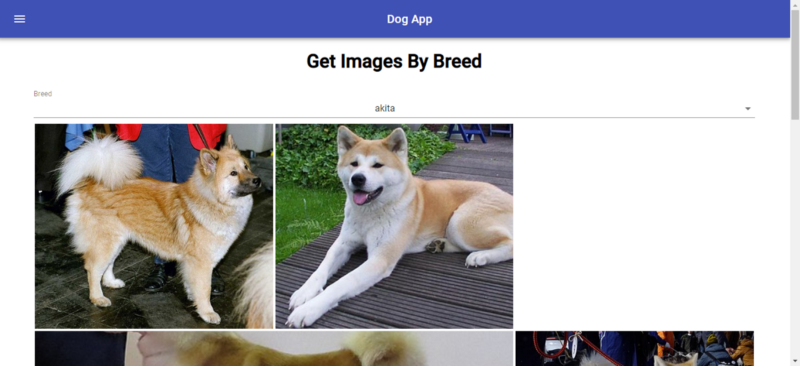
In the end, you get the screen below when you go to [http://localhost:](http://localhost/)3000/breeds: