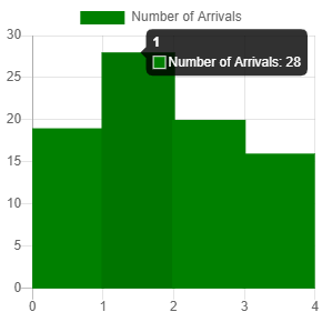
We can create a histogram with Chart.js without a problem.
All we have to do is to create a bar chart with some tweaks.
To start, we add Chart.js for the chart and the canvas for Chart.js to render the chart.
We add them by writing the following HTML:
<script src='https://cdnjs.cloudflare.com/ajax/libs/Chart.js/2.9.3/Chart.min.js'></script>

<canvas id="histogram" width="400" height="400"></canvas>
Next, we create our histogram by writing some JavaScript code:
const ctx = document.getElementById('histogram').getContext('2d');

const chart = new Chart(ctx, {
  type: 'bar',
  data: {
    labels: [0, 1, 2, 3, 4],
    datasets: [{
      label: 'Number of Arrivals',
      data: [19, 28, 20, 16],
      backgroundColor: 'green',
    }]
  },
  options: {
    scales: {
      xAxes: [{
        display: false,
        barPercentage: 1.3,
        ticks: {
          max: 3,
        }
      }, {
        display: true,
        ticks: {
          autoSkip: false,
          max: 4,
        }
      }],
      yAxes: [{
        ticks: {
          beginAtZero: true
        }
      }]
    }
  }
});
We render the chart with the canvas element with the ID histogram as we indicated in the code.
In the object that we passed into the Chart constructor, we set the type to 'bar' to display a bar chart.
Then in datasets, we add our data property to set the bar heights.
The labels are the labels that are displayed on the x-axis.
label is displayed above the histogram.
Then we have to adjust the x-axis options by setting ticks maximum to 4 to adjust the ticks.
We make the bars wider than the typical graph by setting barPercentage to 1.3 so that the 4 bars are event distributed between the 5 ticks of the x-axis.
autoSkip set to false means that automatic calculation of how many labels can be shown or hidden is false.
This lets us override the ticks with the ones that we mentioned above.
autoSkip being false means that we always show all labels.
beginAtZero being true means that we start the y-axis at 0.
In the end, we get the following graph:

We can see the green bars and the bar is between 2 ticks rather than the bar being right above each tick.
