To create charts in React apps, wd can use the React Chartkick NPM package.
We can get started easily.
Create Charts
We run the following commands to install the packages we need:
yarn add react-chartkick chart.js
Chart.js is a dependency required for React Chartkick, so we have to install it.
Then we can create our chart as follows:
import React from "react";
import { LineChart } from "react-chartkick";
import "chart.js";

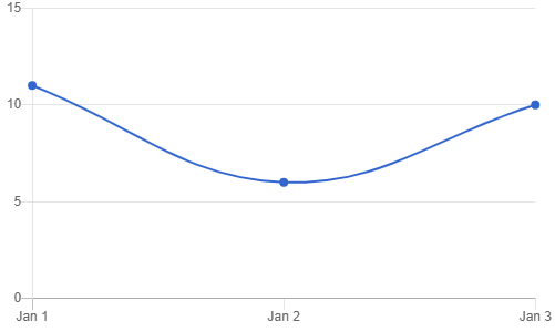
const data = { "2020-01-01": 11, "2020-01-02": 6, "2020-01-03": 10 };
export default function App() {
  return (
    <div className="App">
      <LineChart data={data} />
    </div>
  );
}
We just create an object with the x-axis labels as the keys and the corresponding values for the y-axis.
Once we did that, we get:

To create a bar chart, we can write:
import React from "react";
import { BarChart } from "react-chartkick";
import "chart.js";

const data = [["eat", 32], ["drink", 100]];
export default function App() {
  return (
    <div className="App">
      <BarChart data={data} />
    </div>
  );
}
The data structure and component to import are different, but we can create one without much effort.
Once we wrote the code above, we get:

The React Chartkick package support many other kinds of charts like pie charts, area charts, geo charts, and more.
Options
We can customize the options of the charts to suit our needs.
For instance, we can set the min and max values for the x-axis.
We can use the xmin and xmax props as follows:
import React from "react";
import { LineChart } from "react-chartkick";
import "chart.js";

const data = { "2020-01-01": 11, "2020-01-02": 6, "2020-01-03": 10 };

export default function App() {
  return (
    <div className="App">
      <LineChart data={data} xmin="2020-01-01" xmax="2020-01-03" />
    </div>
  );
}
We make sure that our data matches the x-axis ranges.
Likewise, we can set the range for the y-axis by writing:
import React from "react";
import { LineChart } from "react-chartkick";
import "chart.js";

const data = { "2020-01-01": 11, "2020-01-02": 6, "2020-01-03": 10 };

export default function App() {
  return (
    <div className="App">
      <LineChart
        data={data}
        min={0}
        max={20}
        xmin="2020-01-01"
        xmax="2020-01-03"
      />
    </div>
  );
}
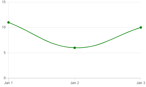
To change the color of the line, we can use the colors prop:
import React from "react";
import { LineChart } from "react-chartkick";
import "chart.js";

const data = { "2020-01-01": 11, "2020-01-02": 6, "2020-01-03": 10 };

export default function App() {
  return (
    <div className="App">
      <LineChart data={data} colors={["green"]} />
    </div>
  );
}
We just pass in an array to change the line color.
One we wrote our code, we get:

Labels and Legends
The React Chartkick NPM package provides with props to enable a legend.
We set the legend prop to true to display a legend.
Then we use the label prop to add text to the legend.
To set the titles for the x and y axes, we can use the xtitle and ytitle props respectively.
For instance, we can write:
import React from "react";
import { LineChart } from "react-chartkick";
import "chart.js";

const data = { "2020-01-01": 11, "2020-01-02": 6, "2020-01-03": 10 };

export default function App() {
  return (
    <div className="App">
      <LineChart
        data={data}
        label="Population"
        legend={true}
        xtitle="Time"
        ytitle="Population"
      />
    </div>
  );
}
Once we did that, we get:

The React Chartkick NPM package has chart components that take many more props to let us create charts.
It’s one of the easiest libraries for us to create charts in React apps.
