Dialogs are frequently used in web apps. They’re used for displaying confirmation messages, alerts and other things that are suitable for popups.
Before the existence of the dialog element, we only have alert and confirm functions built into JavaScript to display text-only messages. They can’t be styled and can’t display anything other than text.
Also alert and confirm dialogs can’t have any button other than whatever’s built-in.
To make creating dialogs easier without adding libraries, now we can use the dialog element to create pop-up dialog boxes.
In this article, we’ll take a look at how to add dialog elements to our apps and do something with them.

Creating Dialogs
To create dialogs, we’ll add the dialog element as follows:
<dialog open>
  <p>Greetings!</p>
</dialog>
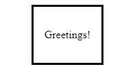
We have a dialog with the open attribute to display the dialog. The default styling depends on the browser.
In Chrome, it looks something like this by default:

We can add any HTML to a dialog element. For example, we can add a form as follows:
<dialog open>
  <form method="dialog">
    <p>
      <label>
        Name:
      </label>
      <input type='type' name='name'>
    </p>

    <p>
      <label>
        Favorite Fruit:
      </label>
      <select name='fruit'>
        <option value='apple' selected>Apple</option>
        <option value='banana'>Banana</option>
        <option value='grape'>Grape</option>
      </select>
    </p>

    <menu>
      <button value="cancel">Cancel</button>
      <button id="confirm-btn" value="default">Confirm</button>
    </menu>
  </form>
</dialog>

<menu>
  <button id="dialog-button">Update Fruit</button>
</menu>

<output></output>
Our dialog has a form element with method set to dialog . This lets us set the return value of the dialog, which we can use after the dialog closes by clicking Confirm.
We also have an input and select element to let us input something into our form.
Also, we have a button with ID dialog-button to open our dialog element
Then in our JavaScript code, we can control the opening and closing of the dialog and get the inputted values as follows:
const dialogButton = document.getElementById('dialog-button');
const dialog = document.querySelector('dialog');
const output = document.querySelector('output');
const input = document.querySelector('input');
const select = document.querySelector('select');
const confirmBtn = document.getElementById('confirm-btn');

dialogButton.addEventListener('click', () => {
  if (typeof dialog.showModal === "function") {
    dialog.showModal();
  }
});

select.addEventListener('change', (e) => {
  confirmBtn.value = [select.value, input.value].join(' ');
});

input.addEventListener('change', (e) => {
  confirmBtn.value = [select.value, input.value].join(' ');
});

dialog.addEventListener('close', () => {
  output.value = dialog.returnValue;
});
To open the dialog we have:
dialogButton.addEventListener('click', () => {
  if (typeof dialog.showModal === "function") {
    dialog.showModal();
  }
});
The showModal method opens the dialog .
Then we have listeners for the select and input to get their values if the user enters anything.
We have:
confirmBtn.value = [select.value, input.value].join(' ');
to get the values from the input and select and set it to the value property of the confirmBtn , which is the Confirm button. This also sets the returnValue of dialog to confirmBtn.value .
Finally, we have:
dialog.addEventListener('close', () => {
  output.value = dialog.returnValue;
});
to get the returnValue , which is obtained from the confirmBtn.value assigned in the input and select listeners.
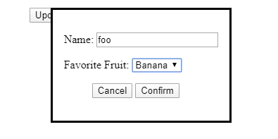
Then we get:

And once we click Confirm, we get:

Styling the Backdrop
To style the dialog ‘s background, we can select it by using the ::backdrop CSS pseudoelement to and apply styles to it. The backdrop is only drawn when the dialog is shown.
For example, we can style it as follows:
dialog::backdrop {
  background-color: lightblue !important;
}
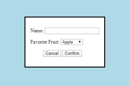
The code above will change the backdrop color from the default to lightblue .
Then we get the following:

The dialog element saves us some effort when creating pop-up dialogs. We don’t need libraries or lots of code to create simple dialogs.
To set the values of dialog.returnValue when the dialog closes, we set the form element’s method to dialog , and set the confirm button’s value attribute to what we want to set it to.
We can use the ::backdrop pseudoelement to style the backdrop’s color when the dialog is open.
