Categories
Vue

Vue Select — Custom Search and Positioning

To make dropdowns easier, we can use the Vue Select plugin to add the dropdown.

It can do much more than the select element.

In this article, we’ll look at how to use the vue-select package to make more complex dropdowns.

Customizing Keydown Behaviour

We can customize keydown behavior to do what we want.

For example, we can write:

<template>
  <div>
    <v-select no-drop taggable multiple :select-on-key-codes="[188, 13]"/>
  </div>
</template>

<script>
export default {
  data: () => ({})
};
</script>

to add the selections when we press the comma key in addition to the return key.

188 is the keycode for the comma key and 13 is the return key.

We can append what we want to the selection after a selection is made.

For example, we can write:

<template>
  <v-select taggable multiple no-drop :map-keydown="handlers" placeholder="enter an email"/>
</template>

<script>
export default {
  methods: {
    handlers: (map, vm) => ({
      ...map,
      50: e => {
        e.preventDefault();
        if (e.key === "@" && vm.search.length > 0) {
          vm.search = `${vm.search}@hotmail.com`;
        }
      }
    })
  }
};
</script>

We append the @hotmail.com suffix to our selection once we type the @ sign and we typed in something to the input box before that.

Popper.js Integration

Vue Select integrates with Popper.js.

For example, we can write:

<template>
  <div style="margin-top: 6em">
    <v-select :options="countries" append-to-body :calculate-position="withPopper"/>
  </div>
</template>

<script>
import { createPopper } from "@popperjs/core";

export default {
  data: () => ({ countries: ["Canada", "United States"], placement: "top" }),
  methods: {
    withPopper(dropdownList, component, { width }) {
      dropdownList.style.width = width;
      const popper = createPopper(component.$refs.toggle, dropdownList, {
        placement: this.placement,
        modifiers: [
          {
            name: "offset",
            options: {
              offset: [0, -1]
            }
          },
          {
            name: "toggleClass",
            enabled: true,
            phase: "write",
            fn({ state }) {
              component.$el.classList.toggle(
                "drop-up",
                state.placement === "top"
              );
            }
          }
        ]
      });
      return () => popper.destroy();
    }
  }
};
</script>

We added the withPopper method to position the dropdown with the modifiers property to let us change the position.

If state.placement is 'top' , then we set the dropdown to drop up instead.

The this.placement variable sets the placement of the dropdown.

If we set the placement to 'bottom' , then we get the dropdown to display at the bottom as usual.

Filtering with Fuse.js

Fuse.js makes filtering the dropdown entries easier for us.

For example, we can write:

<template>
  <v-select :filter="fuseSearch" :options="books" :getOptionLabel="option => option.title">
    <template #option="{ author, title }">
      {{ title }}
      <br>
      <cite>{{ author.firstName }} {{ author.lastName }}</cite>
    </template>
  </v-select>
</template>

<script>
import Fuse from "fuse.js";

export default {
  data() {
    return {
      books: [
        {
          title: "book",
          author: {
            firstName: "james",
            lastName: "smith"
          }
        },
        {
          title: "book 2",
          author: {
            firstName: "jones",
            lastName: "smith"
          }
        },
        {
          title: "javascript for dummies",
          author: {
            firstName: "may",
            lastName: "wong"
          }
        }
      ]
    };
  },
  methods: {
    fuseSearch(options, search) {
      const fuse = new Fuse(options, {
        keys: ["title", "author.firstName", "author.lastName"],
        shouldSort: true
      });
      return search.length
        ? fuse.search(search).map(({ item }) => item)
        : fuse.list;
    }
  }
};
</script>

to add the fuseSearch method to let us do the search.

The method has the options array with all the options.

The search parameter is our search query.

The keys have the properties that we want to search by.

shouldSort lets us set whether we sort the items or not.

We then return the results by using the fuse.search method to do the search.

It’ll search all the properties automatically since we specified them in the keys array.

If the query is empty,. then we return the whole list with fuse.list .

Conclusion

We can customize various behaviors with the Vue Select dropdown.

The dropdown position can be changed, and it integrates with various libraries.

Categories
Vue

Vue Select — Complex Dropdowns and Validation

To make dropdowns easier, we can use the Vue Select plugin to add the dropdown.

It can do much more than the select element.

In this article, we’ll look at how to use the vue-select package to make more complex dropdowns.

Single/Multiple Selection

We can enable multiple selection the v-select component with the multiple prop:

<template>
  <div id="app">
    <v-select multiple v-model="selected" :options="['Canada','United States']"/>
    {{selected}}
  </div>
</template>
<script>
export default {
  name: "App",
  data() {
    return {
      selected: ""
    };
  }
};
</script>

Now we can type in the results and select more than one choice.

Tagging

We can add the taggable prop to add choices that aren’t present in the dropdown.

For example, we can write:

<template>
  <div id="app">
    <v-select taggable multiple v-model="selected" :options="['Canada','United States']"/>
    {{selected}}
  </div>
</template>
<script>
export default {
  name: "App",
  data() {
    return {
      selected: ""
    };
  }
};
</script>

Now we can type in anything and it’ll be selected.

Also, we can add the push-tags prop to push the option to the options array:

<template>
  <div id="app">
    <v-select taggable push-tags multiple v-model="selected" :options="options"/>
    <div>{{selected}}</div>
  </div>
</template>
<script>
export default {
  name: "App",
  data() {
    return {
      selected: "",
      options: ["Canada", "United States"]
    };
  }
};
</script>

Now when we type in something, we’ll see it in the dropdown.

Even though it’s in the dropdown, it’s not added to the options array.

Using taggable & reduce Together

We can use the taggable and reduce props together if we add the create-option prop.

For example, we can write:

<template>
  <div id="app">
    <v-select
      taggable
      multiple
      label="title"
      :options="options"
      v-model="selected"
      :create-option="book => ({ title: book, author: { firstName: '', lastName: '' } })"
      :reduce="book => `${book.author.firstName} ${book.author.lastName}`"
    />
    <div>{{selected}}</div>
  </div>
</template>
<script>
export default {
  name: "App",
  data() {
    return {
      selected: undefined,
      options: [
        {
          title: "HTML for dummies",
          author: {
            firstName: "james",
            lastName: "smith"
          }
        },
        {
          title: "JavaScript for dummies",
          author: {
            firstName: "mary",
            lastName: "smith"
          }
        }
      ]
    };
  }
};
</script>

We have the create-option prop to return the object that we want to add to the dropdown as additional choices.

The reduce prop has a function that determines what’s added to the selected array.

Validation

v-select supports validation.

For example, we can add:

<template>
  <div id="app">
    <v-select :options="options" label="title" v-model="selected">
      <template #search="{attributes, events}">
        <input :required="!selected" v-bind="attributes" v-on="events">
      </template>
    </v-select>
    <div>{{selected}}</div>
  </div>
</template>
<script>
export default {
  name: "App",
  data() {
    return {
      selected: undefined,
      options: ["Canada", "United States"]
    };
  }
};
</script>

to add the required prop to the input for searching for items.

We put our customs search box in the sesrch slot.

And we pass all the attributes and events to the input element.

Conclusion

We can enable multiple selection and add validation to a dropdown with the Vue Select package.

Categories
Vue

Adding Dropdowns to a Vue App with the Vue Select Package

To make dropdowns easier, we can use the Vue Select plugin to add the dropdown.

It can do much more than the select element.

In this article, we’ll look at how to get started with the package.

Getting Started

We can add the package by installing it by running:

npm install vue-select

or

yarn add vue-select

Then we can use it by registering the component in main.js

import Vue from "vue";
import App from "./App.vue";
import vSelect from "vue-select";
import "vue-select/dist/vue-select.css";

Vue.component("v-select", vSelect);
Vue.config.productionTip = false;

new Vue({
  render: (h) => h(App)
}).$mount("#app");

And then in our component file, we add:

<template>
  <div id="app">
    <v-select :options="['Canada', 'United States']"></v-select>
  </div>
</template>

<script>
export default {
  name: "App"
};
</script>

The options prop lets us add the options for the dropdown.

We can also populate the select options with an array:

<template>
  <div id="app">
    <v-select :options="options"></v-select>
  </div>
</template>

<script>
export default {
  name: "App",
  data() {
    return {
      options: [
        { label: "Canada", code: "ca" },
        { label: "United States", code: "us" }
      ]
    };
  }
};
</script>

Then label value will be displayed.

We can set the property name with the strings to display.

For example, we can write:

<template>
  <div id="app">
    <v-select label="countryName" :options="options"></v-select>
  </div>
</template>

<script>
export default {
  name: "App",
  data() {
    return {
      options: [
        { countryName: "Canada", code: "ca" },
        { countryName: "United States", code: "us" }
      ]
    };
  }
};
</script>

Null / Empty Options

We can set options to an empty array if we don’t want any options displayed.

Getting and Setting

We can bind the selected value to a state with v-model .

For example, we can write:

<template>
  <div id="app">
    <v-select v-model="selected" :options="options"></v-select>
    {{selected}}
  </div>
</template>

<script>
export default {
  name: "App",
  data() {
    return {
      selected: "",
      options: ["Canada", "United States"]
    };
  }
};
</script>

selected will automatically be changed to the value selected.

We can also set the value prop if we only want to set the value selected:

<template>
  <div id="app">
    <v-select :value="selected" :options="options"></v-select>
  </div>
</template>

<script>
export default {
  name: "App",
  data() {
    return {
      selected: "Canada",
      options: ["Canada", "United States"]
    };
  }
};
</script>

Returning a Single Key with reduce

We can return a single key with the reduce prop.

For example, if we have:

<template>
  <div id="app">
    <v-select
      v-model="selected"
      :reduce="country => country.code"
      label="countryName"
      :options="options"
    ></v-select>
    {{selected}}
  </div>
</template>
<script>
export default {
  name: "App",
  data() {
    return {
      selected: "",
      options: [
        { countryName: "Canada", code: "ca" },
        { countryName: "United States", code: "us" }
      ]
    };
  }
};
</script>

Then v-model will be bound to the code value of the selected object with the selected object.

reduce works with deeply nested values.

For example, we can write:

<template>
  <div id="app">
    <v-select
      v-model="selected"
      :reduce="country => country.meta.code"
      label="countryName"
      :options="options"
    ></v-select>
    {{selected}}
  </div>
</template>
<script>
export default {
  name: "App",
  data() {
    return {
      selected: "",
      options: [
        { countryName: "Canada", meta: { code: "ca" } },
        { countryName: "United States", meta: { code: "us" } }
      ]
    };
  }
};
</script>

The selected value is now bound to the meta.code property of the selected object.

Conclusion

The vue-select package lets us add a lot more functionality to a dropdown than a regular select element.

Categories
Vue

Add Infinite Scrolling to a Vue App with vue-infinite-scroll

Infinite scrolling is where the user can keep scrolling to get new data and append it to the bottom of the page.

In this article, we’ll look at how to add infinite scrolling to a Vue app with the vue-infinite-scroll plugin.

Install

We can install it by running:

npm install vue-infinite-scroll --save

Usage

After installing it, we can use it.

First, we register the plugin in main.js :

import Vue from "vue";
import App from "./App.vue";
import infiniteScroll from "vue-infinite-scroll";
Vue.use(infiniteScroll);
Vue.config.productionTip = false;

new Vue({
  render: (h) => h(App)
}).$mount("#app");

This registers it globally.

We can also register it locally by writing:

import infiniteScroll from 'vue-infinite-scroll'
new Vue({
  directives: {infiniteScroll}
})

Then we can use it bu writing:

<template>
  <div id="app">
    <div v-infinite-scroll="loadMore" infinite-scroll-disabled="busy" infinite-scroll-distance="10">
      <div v-for="n in num" :key="n">
        <img :src="`https://picsum.photos/id/${n}/300/150`">
      </div>
    </div>
  </div>
</template>

<script>
export default {
  name: "App",
  data() {
    return {
      num: 10,
      busy: false
    };
  },
  methods: {
    loadMore() {
      this.busy = true;
      setTimeout(() => {
        this.num += 50;
        this.busy = false;
      }, 1000);
    }
  }
};
</script>

The v-infinite-scroll directive makes the div become an infinite scrolling container.

We set it to the loadMore method so that we move.

infinite-scroll-distance is the distance in percentage relative to the bottom of the screen.

The loadMore method will run we scroll the screen within the distance of the screen.

infinite-scroll-disabled lets us disabling infinite scrolling when some condition is true .

We display infinite scrolling when we’re loading more data.

Conclusion

We can add infinite scrolling to a Vue app with the vue-infinite-scroll plugin.

Categories
Reviews

Why SiteGround is a Great Hosting Provider for Small WordPress?

SiteGround

SiteGround is a popular shared hosting provider for hosting simple sites.

They offer multiple hosting options.

They offer lots of new features to make hosting WordPress websites easily.

Performance

The performance they offered is good.

SiteGround offers 99.99% uptime and they kept the promise for the last 24 months.

From February 2019 to December 2019, they kept their promise and maintained 99.99% to 100% uptime.

In January 2020, they dropped to having 99.92% uptime.

The loading time is also good. This is important because most people won’t wait for a slow site to load.

The sites that are tested load after less than a second. This is very good since this speed is above average.

Customer Support

SiteGround offers a live chat for support. It’s available 24/7 so you won’t have to worry about it being unavailable.

The support staff answers very quickly, so we can reach them without trouble any time of the day.

Site Migration.

Siteground offers free site migration for 1 site if you move to them.

This way, you won’t have to do the hard work of moving the site yourself.

With this option, we can avoid downtime and worry for any issues that comes up since we get help from SiteGround to do the migration.

Free SSL Certificate and CDN

SiteGround offers integration with CloudFlare so that we can use their CDN to cache our site’s content.

Setting up CloudFlare integration is very easy since e can do it with one click.

This way, it loads faster without us doing much work.

Also, Let’s Encrypt is built-in so we can use the certificate they issue for free.

We won’t have to worry about renewals since it’s done automatically.

WordPress Features

Daily backups are offered for free so we won’t lost any data.

We can keep up to 30 backup copies of our websites.

Also, we can set up unlimited amounts of email accounts for free.

They can be managed with the webmail interface that they offer.

Antispam features are also included so we won’t worry about our inboxes being filled with junk mail.

Also, we can make a staging site so that we can test features that will go to our production website without messing with the production site itself.

More advanced features for people that can program include different versions of PHP so we can maintain compatibility with older apps.

Git integration lets us check-in code to our Git repos and runs code from there from our SiteGround account.

Caching is also offered so users don’t have to repeatedly download the same content again and again.

Uptime is maintained by generating alerts when it’s down. And SiteGround’s sysadmins will take a look at them immediately.

Also, we can collaborate with other people and show sites to clients.

MySQL and PostgresSQL database management systems are offered so we can pick the database system of our choice to use.

Apache or Nginx can be used for reversed proxies.

At least one WordPress site can be migrated for free, depending on the plan.

Conclusion

Overall, they have lots of useful features for hosting small sites.

They offer security and performance that are above average.

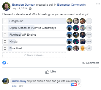
The polls shows that many people like Siteground:

SiteGround poll

Click Here to Sign Up for Siteground Hosting