
CSS grid lets us create layouts with CSS easily.
It’s also good for creating responsive layouts because we can group different items together.
In this article, we’ll look at how to define a grid layout also make it responsive.
Defining a Grid Layout
We can define a grid layout with some HTML and CSS.
If we want to define 4 div’s with one header, one left and right div with an empty space in between it, and one footer, we can do it as follows.
First, we add the HTML:
<div class='container'>
  <div class='item-a'>
    A
  </div>
  <div class='item-b'>
    B
  </div>
  <div class='item-c'>
    C
  </div>
  <div class='item-d'>
    D
  </div>
</div>
Then we add the CSS:
.item-a {
  grid-area: header;
  background-color: lightyellow;
}

.item-b {
  grid-area: main;
  background-color: lightgreen;
}

.item-c {
  grid-area: sidebar;
  background-color: lightblue;
}

.item-d {
  grid-area: footer;
  background-color: pink;
}

.container {
  display: grid;
  grid-template-columns: 24vw 25vw 25vw 24vw;
  grid-template-rows: auto;
  grid-template-areas:
    "header header header header"
    "main main . sidebar"
    "footer footer footer footer";
}
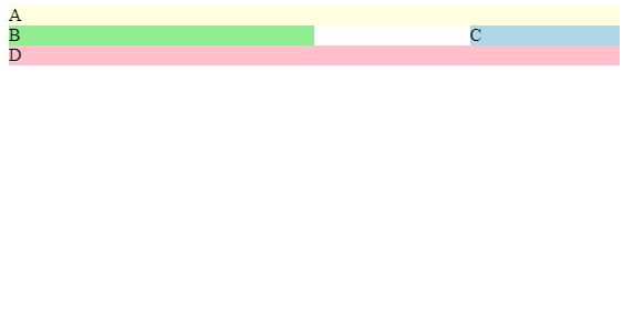
Then we get the following:
The CSS has the following parts.
First, we look at the container class. This is the most important part of the grid.
We have display: grid; which designates that the div with the container class has a grid layout.
Then we define the grid columns with the grid-template-columns , which we set the value to 24vw 25vw 25vw 24vw .
This means we have 4 columns with the leftmost and rightmost columns having 24vw and the one in between having 25vw .
Then we have grid-template-rows: auto; . We leave it as auto since we aren’t concerned with the height of the rows.
To define how the grid is shared between the components inside the div with the container class, we write:
grid-template-areas:
    "header header header header"
    "main main . sidebar"
    "footer footer footer footer";
We have the first row all fille with the header area in the first row.
Then in the new row, we have the main area fill the 2 leftmost columns. A dot for an empty space, and the sidebar area for the rightmost column.
In the bottom row, we have the footer area fill the whole row.
Then we can designate the areas with the item classes as follows:
.item-a {
  grid-area: header;
  background-color: lightyellow;
}

.item-b {
  grid-area: main;
  background-color: lightgreen;
}

.item-c {
  grid-area: sidebar;
  background-color: lightblue;
}

.item-d {
  grid-area: footer;
  background-color: pink;
}
In the code above, we designated whatever having the item-a class as the header with the grid-area and set the background color.
This means that whatever has the class item-a will be the header that fills the top row.
Then we do the same with the other 3 classes, so whatever has the class item-b will fill the leftmost 2 columns in the second row. The element with the class item-c fills the rightmost column of the second row. The element with the class item-d fills all of the bottom rows.
This is how we define a layout with a grid.
Responsive Layout
We can define a responsive layout with CSS selectors and adding a new layout for narrow screens.
We can define a narrow screen layout that only shows the header, main and footer areas as follows:
.item-a {
  grid-area: header;
  background-color: lightyellow;
}

.item-b {
  grid-area: main;
  background-color: lightgreen;
}

.item-c {
  grid-area: sidebar;
  background-color: lightblue;
}

.item-d {
  grid-area: footer;
  background-color: pink;
}

.container {
  display: grid;
  grid-template-rows: auto;
}

@media only screen and (min-width: 751px) {
  .container {
    grid-template-columns: 24vw 25vw 25vw 24vw;
    grid-template-areas:
      "header header header header"
      "main main . sidebar"
      "footer footer footer footer";
  }
}

@media only screen and (max-width: 750px) {
  .item-c {
    display: none;
  }

  .container {
    grid-template-columns: 90vw;
    grid-template-rows: auto;
    grid-template-areas:
      "header"
      "main"
      "footer";
  }
}
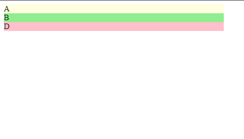
All we did is hide anything with class item-c when the screen width is 750px or less. Otherwise, we keep the same layout as before.
Otherwise, we just move the code around a bit to prevent duplication.
Then when our screen is narrow, we get
Conclusion
Using the CSS grid, making layouts is easier than ever.
First, we set the container div to display: grid to make it a container for a grid.
We then can define layouts with the grid-template-columns to define the columns, grid-template-rows to define the rows. This will form a grid.
Then we set the grid-template-areas attribute to define our layout one row at a time.
We can extend this to be responsive by using CSS media queries and then defining alternative layouts for different screen sizes.