Categories
Chart.js JavaScript

Chart.js – Create a Histogram

We can create a histogram with Chart.js without a problem.

All we have to do is to create a bar chart with some tweaks.

To start, we add Chart.js for the chart and the canvas for Chart.js to render the chart.

We add them by writing the following HTML:

<script src='https://cdnjs.cloudflare.com/ajax/libs/Chart.js/2.9.3/Chart.min.js'></script>

<canvas id="histogram" width="400" height="400"></canvas>

Next, we create our histogram by writing some JavaScript code:

const ctx = document.getElementById('histogram').getContext('2d');

const chart = new Chart(ctx, {
  type: 'bar',
  data: {
    labels: [0, 1, 2, 3, 4],
    datasets: [{
      label: 'Number of Arrivals',
      data: [19, 28, 20, 16],
      backgroundColor: 'green',
    }]
  },
  options: {
    scales: {
      xAxes: [{
        display: false,
        barPercentage: 1.3,
        ticks: {
          max: 3,
        }
      }, {
        display: true,
        ticks: {
          autoSkip: false,
          max: 4,
        }
      }],
      yAxes: [{
        ticks: {
          beginAtZero: true
        }
      }]
    }
  }
});

We render the chart with the canvas element with the ID histogram as we indicated in the code.

In the object that we passed into the Chart constructor, we set the type to 'bar' to display a bar chart.

Then in datasets, we add our data property to set the bar heights.

The labels are the labels that are displayed on the x-axis.

label is displayed above the histogram.

Then we have to adjust the x-axis options by setting ticks maximum to 4 to adjust the ticks.

We make the bars wider than the typical graph by setting barPercentage to 1.3 so that the 4 bars are event distributed between the 5 ticks of the x-axis.

autoSkip set to false means that automatic calculation of how many labels can be shown or hidden is false.

This lets us override the ticks with the ones that we mentioned above.

autoSkip being false means that we always show all labels.

beginAtZero being true means that we start the y-axis at 0.

In the end, we get the following graph:

https://thewebdev.info/wp-content/uploads/2020/04/histogram.png

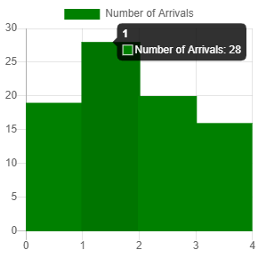
We can see the green bars and the bar is between 2 ticks rather than the bar being right above each tick.

Categories
Chart.js JavaScript

Chart.js – Creating a Chart with Multiple Lines

To create a chart with multiple lines, we can just create a line chart that display multiple data sets.

To do that, we first start with including the Chart.js library.

Also, we add the moment.js library for formatting dates, and a canvas element for Chart.js to render the chart in.

We do that by writing:

<script src='https://cdnjs.cloudflare.com/ajax/libs/Chart.js/2.9.3/Chart.min.js'></script>
<script src='https://cdnjs.cloudflare.com/ajax/libs/moment.js/2.24.0/moment.min.js'></script>

<canvas id="multipleLineChart" width="400" height="400"></canvas>

Next, we create our chart with multiple lines by writing the following:

const ctx = document.getElementById('multipleLineChart').getContext('2d');

const chart = new Chart(ctx, {
  type: 'line',
  data: {
    labels: [
      moment(new Date(2020, 2, 1)).format('YYYY-MM-DD'),
      moment(new Date(2020, 2, 2)).format('YYYY-MM-DD'),
      moment(new Date(2020, 2, 3)).format('YYYY-MM-DD')
    ],
    datasets: [{
        label: '# of Red Votes',
        data: [12, 18, 22],
        borderWidth: 1,
        fill: false,
        borderColor: 'red'
      },
      {
        label: '# of Green Votes',
        data: [12, 2, 13],
        borderWidth: 1,
        fill: false,
        borderColor: 'green'
      }
    ]
  },
  options: {
    scales: {
      yAxes: [{
        ticks: {
          beginAtZero: true
        }
      }]
    }
  }
});

We set the type property to 'line' to display line charts.

Then we have the labels property to display the labels for the x-axis.

In the datasets property, we set the value to an array.

The array has the data property to set the y-axis value for where the dot is displayed.

We set the fill property to false so that we don’t get any filling between the line and the x-axis.

borderColor has the color value of the line. We set one to 'red' and the other to 'green'.

In the options property, we set the beginAtZero property to true so that the y-axis begins at zero.

Once we write that code, we get a chart with multiple lines with one being red and the other being green.

It looks like:

https://thewebdev.info/wp-content/uploads/2020/04/multiplelines.png

Categories
Chart.js JavaScript

Create a Grouped Bar Chart with Chart.js

We can make a grouped bar chart with Chart.js by creating a bar chart that has multiple datasets entries.

To start, we first include the Chart.js library. We also include the moment.js library for formatting dates.

The grouped bar chart will be rendered in a canvas element.

So we write the following code to include all that:

<script src='https://cdnjs.cloudflare.com/ajax/libs/moment.js/2.24.0/moment.min.js'></script>

<canvas id="barChart" width="400" height="400"></canvas>

Next, we add the code for rendering the grouped bar chart.

We write the following:

const ctx = document.getElementById('barChart').getContext('2d');

const chart = new Chart(ctx, {
  type: 'bar',
  data: {
    labels: [
      moment(new Date(2020, 1, 1)).format('YYYY-MM-DD'),
      moment(new Date(2020, 1, 2)).format('YYYY-MM-DD'),
      moment(new Date(2020, 1, 3)).format('YYYY-MM-DD')
    ],
    datasets: [{
        label: '# of Red Votes',
        data: [12, 18, 22],
        borderWidth: 1,
        backgroundColor: ['red', 'red', 'red']
      },
      {
        label: '# of Green Votes',
        data: [12, 2, 13],
        borderWidth: 1,
        backgroundColor: ['green', 'green', 'green']
      }
    ]
  },
  options: {
    scales: {
      yAxes: [{
        ticks: {
          beginAtZero: true
        }
      }]
    }
  }
});

The code above has the labels property with the labels for the x-axis.

The datasets property has the data sets we display on the y-axis.

data has the bar heights for each bar.

label has the label for each bar.

backgroundColor has the background color for each bar.

borderWidth has the border width for each bar.

Then in the options property, we have the beginAtZero property to make sure that the y-axis starts at zero instead of the value of the lowest bar value.

In the end, we have:

https://thewebdev.info/wp-content/uploads/2020/04/groupedbar.png

It’s a grouped bar chart with red and green bars displaying the data in the data arrays.

With Chart.js, creating a grouped bar chart is just a matter of setting the labels, bar heights, and bar colors of each bar.

Categories
Chart.js JavaScript

Create a Stack Bar Chart with Chart.js

We can create stacked bar chart with Chart.js

With the stacked option in Chart.js, we can create a stacked bar chart from a simple bar chart.

To create the chart, first we need to add Chart.js to our code by writing:

<script src='https://cdnjs.cloudflare.com/ajax/libs/Chart.js/2.9.3/Chart.min.js'></script>
<script src='https://cdnjs.cloudflare.com/ajax/libs/moment.js/2.24.0/moment.min.js'></script>

<canvas id="barChart" width="400" height="400"></canvas>

The code above also adds moment.js for manipulating time and a canvas element to display the chart.

Then we write:

const ctx = document.getElementById('barChart').getContext('2d');

const chart = new Chart(ctx, {
  type: 'bar',
  data: {
    labels: [
      moment(new Date(2020, 0, 1)).format('YYYY-MM-DD'),
      moment(new Date(2020, 0, 2)).format('YYYY-MM-DD'),
      moment(new Date(2020, 0, 3)).format('YYYY-MM-DD')
    ],
    datasets: [{
        label: '# of Green Votes',
        data: [12, 19, 13],
        borderWidth: 1,
        backgroundColor: ['green', 'green', 'green']
      },
      {
        label: '# of Pink Votes',
        data: [15, 9, 19],
        borderWidth: 1,
        backgroundColor: ['pink', 'pink', 'pink']
      }
    ]
  },
  options: {
    scales: {
      xAxes: [{
        stacked: true
      }],
      yAxes: [{
        stacked: true
      }]
    }
  }
});

We’ve specified by the labels in the labels property to be 3 dates.

In the datasets property, we have the label to display the label of the legtnd.

The borderWidth has the border with value of the bar in pixels.

The backgroundColor has the background color of the bars.

The data has the bar heights of the bars.

The options object has the property that lets us create a stacked bar chart.

We have the xAxes property, which has an array with an object that has stacked set to true.

Also, we have the same property in the object in the yAxes array.

Once we have that, we get:

https://thewebdev.info/wp-content/uploads/2020/04/stackedbar.png

Creating a stacked bar chart is just as easy as add the data to display for each bar.

Then we set the stacked option in the options object to make 2 or more bars stacked together.

Categories
Chart.js JavaScript

Chart.js Bar Chart Example

Creating a bar chart isn’t very hard with Chart.js.

In this article, we’ll look at a Chart.js bar chart example to see how we can create a simple bar chart with little effort.

First, we have to include the Chart.js library. It uses the canvas to render chart data.

So, we have to write:

<script src='https://cdnjs.cloudflare.com/ajax/libs/Chart.js/2.9.3/Chart.min.js'></script>

<canvas id="barChart" width="400" height="400"></canvas>

To add Chart.js and our canvas.

Then we can write the following JavaScript code to create our bar chart:

const ctx = document.getElementById('barChart').getContext('2d');

const colorLabels = ['red', 'green', 'blue', 'yellow', 'orange']

const chart = new Chart(ctx, {
  type: 'bar',
  data: {
    labels: colorLabels,
    datasets: [{
      label: '# of Votes',
      data: [12, 19, 3, 5, 2],
      borderWidth: 1,
      backgroundColor: colorLabels
    }]
  },
  options: {
    scales: {
      yAxes: [{
        ticks: {
          beginAtZero: true
        }
      }]
    }
  }
});

We set the labels property to set the labels at the x-axis.

The data array has the bar heights.

borderWidth sets the border widths of the bars.

backgroundColor set the colors of the bars.

In the options property, we have the yAxes property, which is an array.

In the array entry, we have the ticks property, which has the beginAtZero property set to true so that the y-axis starts at zero instead of the value of the shortest bar, which is 2.

Then we get:

https://thewebdev.info/wp-content/uploads/2020/04/barchart.png

As we can see from the Chart.js bar chart example we have above, it’s a simple task to create a bar chart from any existing data.