Categories
React

React Styled Components — Animation and Theming

React is the most used front end library for building modern, interactive front end web apps. It can also be used to build mobile apps.

In this article, we’ll look at how to create styled-components with animation and theming with styled-components .

Animations

We can use CSS animations to animate styled-components with styled-components. For instance, we can write the following code to do that:

import React from "react";
import styled, { keyframes } from "styled-components";

const rotate = keyframes`
  from {
    transform: rotate(0deg);
  }
  to {
    transform: rotate(360deg);
  }
`;

const Rotate = styled.div`
  display: inline-block;
  animation: ${rotate} 2s linear infinite;
  padding: 5px;
  font-size: 1.2rem;
`;

export default function App() {
  return (
    <div className="App">
      <Rotate>foo</Rotate>
    </div>
  );
}

In the code above, we create the rotate animation with the keyframes function. We just pass in animation code as we do with normal CSS animations.

To rotation is 360-degree rotation.

Then we include rotate inside the template string where would normally put our animation definition. We specified it to run forever.

Finally, we put Rotate in App with the text that we want to rotate inside to rotate it.

Theming

We can theme by exporting using theThemeProvider component. For instance, we can use it as follows:

import React from "react";
import styled, { ThemeProvider } from "styled-components";

const Button = styled.button`
  font-size: 1em;
  margin: 1em;
  padding: 5px;
  color: ${props => props.theme.main};
  border: 2px solid ${props => props.theme.main};
`;
Button.defaultProps = {
  theme: {
    main: "red"
  }
};

const theme = {
  main: "green"
};

export default function App() {
  return (
    <div className="App">
      <Button>Normal</Button>
      <ThemeProvider theme={theme}>
        <Button>Themed</Button>
      </ThemeProvider>
    </div>
  );
}

In the code above, we have the ThemeProvider component that’s provided by styled-components .

We then defined a styled button with:

const Button = styled.button`
  font-size: 1em;
  margin: 1em;
  padding: 5px;
  color: ${props => props.theme.main};
  border: 2px solid ${props => props.theme.main};
`;
Button.defaultProps = {
  theme: {
    main: "red"
  }
};

We take the theme.main property to which has the color to apply the color selectively. If it’s not defined, then we set the button color to red.

Then the button that’s added outside the ThemeProvider has a red border and text. The button inside the ThemeProvider is green as we defined in:

const theme = {
  main: "green"
};

Function Themes

We can also define functions for theming purposes. For instance, we can define a base theme and a theme based off of it by writing the following code:

import React from "react";
import styled, { ThemeProvider } from "styled-components";

const Button = styled.button`
  font-size: 1em;
  margin: 1em;
  padding: 5px;
  color: ${props => props.theme.fg};
  background-color: ${props => props.theme.bg};
`;

const baseTheme = {
  fg: "green",
  bg: "white"
};

const theme = ({ fg, bg }) => ({
  fg: bg,
  bg: fg
});

export default function App() {
  return (
    <ThemeProvider theme={baseTheme}>
      <Button>Normal</Button>
      <ThemeProvider theme={theme}>
        <Button>Inverted</Button>
      </ThemeProvider>
    </ThemeProvider>
  );
}

In the code above, we have a styled Button component that takes variable styling from the theme. We access the theme variables in the theme property.

Then we defined a baseTheme , which has the foreground and background colors of the button.

Then we defined theme , which invert the colors from the base theme by flipping the foreground and background colors.

Therefore, the Normal button has green text and white background, and the Inverted button has a green background with white text.

Getting the Theme Without Styled Components

We can use themes without applying them to styled-components. To do this, we use the withTheme function.

For instance, we can use it as follows:

import React from "react";
import { ThemeProvider, withTheme } from "styled-components";

const baseTheme = {
  color: "green",
  backgroundColor: "white"
};

let Foo = ({ theme, children }) => {
  return <div style={theme}>{children}</div>;
};

Foo = withTheme(Foo);

export default function App() {
  return (
    <div>
      <ThemeProvider theme={baseTheme}>
        <Foo>foo</Foo>
      </ThemeProvider>
    </div>
  );
}

In the code above, we defined the Foo component, which takes the theme prop to get the styles from the baseTheme object.

Then since we wrapped ThemeProvider around the Foo component, we can get the styles in baseTheme with the theme prop.

In Foo , we passed it straight into the style prop to style our Foo component.

Therefore, we’ll see ‘foo’ displayed in green on the screen.

Conclusion

We can create animations with CSS animation. To create one, we use the keyframe tag with the animation put in the string. Then we put the returned animation code in our CSS where the animation-name would be.

styled-components supports theming. We can theme it with the ThemeProvider component. Then we can pass the styles to components with styled-components or the components that we defined without it.
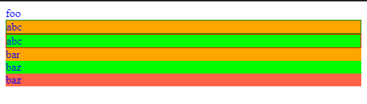
Categories
React

React Styled Components — More Complex Selectors and Selectively Passing Props

React is the most used front end library for building modern, interactive front end web apps. It can also be used to build mobile apps.

In this article, we’ll look at creating styled-components with pseudo selectors and creating styled wrappers for other components.

Define Styled Components Outside of the Render Method

We can define styled-components outside of the render method with styled-components .

For instance, we can define a wrapper component as follows:

import React from "react";
import styled from "styled-components";

const StyledWrapper = styled.div`
  font-weight: bold;
`;

const Wrapper = ({ message }) => {
  return <StyledWrapper>{message}</StyledWrapper>;
};

export default function App() {
  return (
    <div className="App">
      <Wrapper message="foo" />
    </div>
  );
}

In the code above, we created the StyledWrapper component with its own styles. Then we created the Wrapper component which uses it. with the message prop passed inside. Then we can ass message as a prop to Wrapper used in App .

Therefore, we’ll see the word ‘foo’ bolded displayed on the screen.

Pseudoelements, Pseudoselectors, and Nesting

styled-components supports SCSS-like syntax for defining styles for a styled component. The preprocessor that uses for transforming CSS is stylis.

For instance, we can write the following code to define styles with props and stylis code as follows:

import React from "react";
import styled from "styled-components";

const Thing = styled.div.attrs(() => ({ tabIndex: 0 }))`
  color: blue;
  &:hover {
    color: red;
  }
  & ~ & {
    background: tomato;
  }
  & + & {
    background: lime;
  }
  &.foo {
    background: orange;
  }
  .foo & {
    border: 1px solid ${props => (props.primary ? "red" : "green")};
  }
`;

export default function App() {
  return (
    <div className="App">
      <Thing>foo</Thing>
      <Thing className="foo" primary>
        <Thing>abc</Thing>
        <Thing primary>abc</Thing>
        bar
      </Thing>
      <Thing className="bar">baz</Thing>
      <Thing>baz</Thing>
    </div>
  );
}

In the code above, we have the Thing component, where we defined styles with pseudo selectors.

&:hover is the selector for when Thing is hovered.

& ~ & is the selector for the sibling of Thing but it may not be directly next to it.

& + & is the Thing next to a Thing .

&.foo is the Thing with a foo CSS class.

.foo & is the Thing inside something with the foo class. We also have a dynamic style with ${props => (props.primary ? “red” : “green”)} where we check for the primary prop and then apply the color accordingly.

Then we get the following colored text:

We can add the && pseudoselector to increase the specificity of the rules on the component.

For instance, we can write:

import React from "react";
import styled from "styled-components";

const Thing = styled.div`
  && {
    color: blue;
  }
`;

export default function App() {
  return (
    <div className="App">
      <Thing>foo</Thing>
    </div>
  );
}

Then we only apply the specified style to Thing . Therefore, we avoid conflicts with styles in other components with && .

Photo by Pineapple Supply Co. on Unsplash

Attaching Additional Props

We can pass in a callback to the attrs method so that we can choose the props that the base element receives. For instance, if we have an input and we want it to only receive the value attribute and the size prop, we can write:

import React from "react";
import styled from "styled-components";

const Input = styled.input.attrs(({ value, size }) => ({
  size,
  value
}))`
  color: palevioletred;
  font-size: 1em;
  margin: ${props => props.size};
  padding: ${props => props.size};
`;

export default function App() {
  return (
    <div className="App">
      <Input value="foo" size="5px" />
    </div>
  );
}

In the code above, we took the value andsize props and set them as attributes in the callback that we pass into the attrs method.

We also passed in the size prop into our styles dynamically in the string.

Then when we add the Input with the value set to 'foo' and size set to '5px' , then we’ll see those reflected in our styled input.

Conclusion

We can create styled components that are outside of the render method. Also, in addition to CSS selectors, we can use SCSS selectors for selecting elements.

The & selector is useful for selecting the current element. We can then use other selectors to select neighboring or child elements.

Also, we can use the && selector to select one specific element.

Finally, we can use the attrs method to selectively pass props as attribute values of components.

Categories
React

Creating React Styled Components with Dynamic Tags and Props

React is the most used front end library for building modern, interactive front end web apps. It can also be used to build mobile apps.

In this article, we’ll look at how to create React styled-components with varying tags with the styled-components package fo React.

Changing the Tags When Rendering Styled Components

We can pass in the as prop to render a styled component with different tags than we originally defined them as. For instance, we can write the following code to do that:

import React from "react";
import styled from "styled-components";

const Title = styled.h1`
  color: palevioletred;
  font-size: 1.5em;
  margin: 1em;
`;

const GreenTitle = styled(Title)`
  color: green;
`;

const BlueTitle = styled(Title)`
  color: blue;
`;

export default function App() {
  return (
    <div className="App">
      <Title>hello</Title>
      <GreenTitle as="p">hello</GreenTitle>
      <BlueTitle as="span">hello</BlueTitle>
    </div>
  );
}

In the code above, we have multiple styled-components with several variations. Then in App , we added the as prop we want to render the component so that we can render the way we want to them do.

Now when we inspect the components, we’ll see that the rendered element has the same tag as we specified in the as prop.

The as prop also works with custom components. For instance, we can write the following code to change the tag that’s rendered in a component that’s defined without using styled-component :

import React from "react";
import styled from "styled-components";

const H1 = styled.h1`
  color: green;
  font-size: 1em;
  margin: 1em;
  padding: 0.25em 1em;
  display: block;
`;

const Title = ({ children, ...props }) => <H1 {...props}>{children}</H1>;

export default function App() {
  return (
    <div className="App">
      <Title as="p">hello</Title>
    </div>
  );
}

In the code above, we have the Title component, which returns the H1 component. We pass all the props to the H1 component, and the children in between the H1 tags.

Then we can use the as prop on the H1 . There’s no difference if we pass in the as directly or passing the as prop through another component. As long we the as prop ends up in a component that’s created with styled-components , the as prop can be applied.

Therefore, we should get the p element displayed instead of H1 as we originally created it.

Styling Any Component

The styled method works on any component, as long we attached the passed className prop a DOM element.

For instance, we can use it as follows:

import React from "react";
import styled from "styled-components";

const Title = ({ className, children }) => (
  <h1 className={className}>{children}</h1>
);

const StyledTitle = styled(Title)`
  color: green;
  font-weight: bold;
`;

export default function App() {
  return (
    <div className="App">
      <Title>hello</Title>
      <StyledTitle>hello</StyledTitle>
    </div>
  );
}

The className is passed from the props in Title so that we can apply the class name generated by the styled-components package to apply the styles.

To create the StyledTitle component, we called the styled function with the Title component passed in. Then we can applied the styles with the template as we did with component built into styled-components.

When we render both components in App , we see that the top title has no styling and the second one has styling.

Photo by Shyam Sundar Hemamalini on Unsplash

Passed Props

Props that are passed into styled-components are passed in as attributes of HTML elements. If the component being modified is a React component, then the props are passed through as props.

For instance, we can pass in the value attribute to our styled input element as follows:

import React from "react";
import styled from "styled-components";

const Input = styled.input`
  padding: 0.5em;
  margin: 0.5em;
  color: ${props => props.inputColor || "palevioletred"};
  border-radius: 3px;
`;

export default function App() {
  return (
    <div className="App">
      <Input value="foo" inputColor="red" />
    </div>
  );
}

As we can see, we just pass them in as we did with any HTML element., Then the input will be displayed since we passed in 'foo' for value .

Therefore, we should see 'foo' displayed as the value of the input.

For React components, we can pass props to them as follows:

import React from "react";
import styled from "styled-components";

const Foo = ({ text, ...style }) => <p style={style}>{text}</p>;

const StyledFoo = styled(Foo)`
  padding: 0.5em;
  margin: 0.5em;
  color: ${props => props.color || "palevioletred"};
  border-radius: 3px;
`;

export default function App() {
  return (
    <div className="App">
      <StyledFoo color="red" text="foo" />
    </div>
  );
}

In the code above, we passed in the text and color props. The text prop ends up between the p tags of Foo . The styles are in the style prop and are passed into the style prop of p.

Conclusion

We can style any HTML element as if we pass in the className prop generated by styled-components to the component that we want to style.

Also, we can change the tag that the styled component is rendered as with the as prop.

Finally, we can pass props into styled elements as we do with any other HTML element.

Categories
React

Creating React Components with Styling with the styled-components Package

React is the most used front end library for building modern, interactive front end web apps. It can also be used to build mobile apps.

In this article, we’ll look at how to use the styled-components package to create components that has styling without writing lots of boilerplate code.

Why Do We Need This Package?

The styled-components package lets us create components with styling injected by us without writing lots of code.

Class names are generated automatically with the styling code so that we don’t have to write them ourselves. Therefore, we don’t have to worry about duplication or conflicts.

CSS can easily be deleted if it’s unused. This is a feature that normal CSS doesn’t have.

Dynamic styling is also easy to add by passing in our own props to our styled-components created with styled-components .

Vendor prefixes are also applied to styles automatically so that we don’t have to type them ourselves.

Installation

We can install it by running:

npm install --save styled-components

Getting Started

After installation, we can define our components with the built-in template tags. Template tags are just functions. In this case, they return components that we can use.

For instance, we can create a styled h1 element by writing:

import React from "react";
import styled from "styled-components";

const Title = styled.h1`
  font-size: 1.5em;
  text-align: center;
  color: green;
`;

export default function App() {
  return (
    <div className="App">
      <Title>Hello</Title>
    </div>
  );
}

In the code above, we used the styled.h1 tag to with styles inside the template string to create the Title component. We used it as we did in the App component.

We specified that Title has font-size 1.5em, is centered, and the color is green. Therefore, that’s what we should see when we use it in App .

We can nest these components as we do with normal HTML elements. For instance, we can write:

import React from "react";
import styled from "styled-components";

const Wrapper = styled.div`
  padding: 4em;
  background: yellow;
`;

const Title = styled.h1`
  font-size: 1.5em;
  text-align: center;
  color: green;
`;

export default function App() {
  return (
    <div className="App">
      <Wrapper>
        <Title>Hello</Title>
      </Wrapper>
    </div>
  );
}

In the code above, we added the Wrapper component, which has a yellow background and some padding.

App uses wrapper, which wraps around our Title component. Therefore, now we should see a yellow background with the green title text inside.

Adding Dynamic Styling with Props

We can pass in props into a styled component and access the props via the props variable as we do with any other component. For instance, we can turn our Title component into a dynamically styled component by writing:

import React from "react";
import styled from "styled-components";

const Title = styled.h1`
  font-size: 1.5em;
  color: ${props => (props.primary ? "red" : "green")};
`;

export default function App() {
  const [primary, setPrimary] = React.useState(false);
  return (
    <div className="App">
      <button onClick={() => setPrimary(primary => !primary)}>Toggle</button>
      <Title primary={primary}>Hello</Title>
    </div>
  );
}

In the code above, we have:

color: ${props => (props.primary ? "red" : "green")};

The props is what we passed in as props, which we did with:

<Title primary={primary}>Hello</Title>

With the button in App , we toggled the primary prop’s value, so that we toggle between red and green as we click on the Toggle button.

Extending Styles

We often have to create a styled component, but with some slight variations. To do this with styled-components without duplicating code, we can use the styled function as follows:

import React from "react";
import styled from "styled-components";

const Title = styled.h1`
  color: palevioletred;
  font-size: 1.5em;
  margin: 1em;
`;

const GreenTitle = styled(Title)`
  color: green;
`;

const BlueTitle = styled(Title)`
  color: blue;
`;

export default function App() {
  return (
    <div className="App">
      <Title>hello</Title>
      <GreenTitle>hello</GreenTitle>
      <BlueTitle>hello</BlueTitle>
    </div>
  );
}

In the code above, we have Title , which serves as a base component for creating GreenTitle and BlueTitle . We used the styled function with Title passed in, which returns a new template tag. Then we used that with new color styles to create an h1 element with new colors.

Therefore, once we put them in App , we should see them all rendered.

Conclusion

With the styled-components package, we can create HTML elements with the styles we want baked-in. The return elements can take props which allows for dynamic styling. All we have to do is used the built-in template tags with the styles we want to add, and it’ll return the styled elements for us to use.

Categories
React

React Styled Components — Existing CSS and Template Tags

React is the most used front end library for building modern, interactive front end web apps. It can also be used to build mobile apps.

In this article, we’ll look at how to deal with existing CSS so that they don’t conflict with styled-components created with styled-components ‘s styles. Also, we look at how to refer to other components.

Existing CSS

We can pass in class names that are generated with styled-components in addition to the ones that are generated else in the same code. This applies to components that are created with the styled(Component) function.

For instance, we can do that as follows:

styles.css :

.lightgreen {
  background-color: lightgreen;
}

App.js :

import React from "react";
import styled from "styled-components";
import "./styles.css";

const Foo = ({ className }) => {
  return <div className={`lightgreen ${className}`}>foo</div>;
};

const StyledFoo = styled(Foo)`
  color: green;
`;

export default function App() {
  return (
    <div>
      <StyledFoo>foo</StyledFoo>
    </div>
  );
}

In the code above, we have the StyledFoo component, which is created from the Foo component. Since we called styled(Foo) , we’ll have access to the className prop that’s generated when we called that in Foo .

Now we can combine class names from another CSS file as we did with styles.css and the className generated from styled-components via the className prop as we have in Foo .

Therefore, we have ‘foo’ in green with a light green background.

Issues with Specificity

The example above doesn’t have conflicting styles. However, we often have conflicting styles from the CSS and what we have in the styles component created with styled-components .

For instance, if we have the following example:

styles.css :

.red {
  color: red;
}

App.js :

import React from "react";
import styled from "styled-components";
import "./styles.css";

const StyledFoo = styled.div`
  color: green;
`;

export default function App() {
  return (
    <div>
      <StyledFoo className="red">foo</StyledFoo>
    </div>
  );
}

The styles from the red class take precedence over the green color in the StyledFoo component since it’s injected directly into the component.

By the rule of specificity, the styles that are injected nearest the component we’re styling will take precedence.

If we want to keep the styles of the StyledFoo component, then we move it outside the StyledFoo component.

We can avoid conflicts by namespacing the CSS class names that are generated by styled-components . To do that, we use the babel-plugin-styled-components-css-namespace plugin.

We just have to install it by running:

npm install @quickbaseoss/babel-plugin-styled-components-css-namespace

Then add it to the Babel configuration as follows:

"babel": {
  "plugins": [
    "@quickbaseoss/babel-plugin-styled-components-css-namespace"
  ]
}

Tagged Template Literals

Tagged Template Literals are new to ES6. The following code are the same:

foo `string`
foo(['string'])

where foo is a function like:

const foo = () => {}

styled-components returns new components with the styles added by passing in the CSS string into the tags and then doing its own processing to return a new component.

Referring to Other Components from a Component

A styled component created with styled-component can refer to another component in its style. For instance, we can write the following code to do that:

import React from "react";
import styled from "styled-components";
import "./styles.css";

const Foo = styled.div`
  color: green;
`;

const HoveredFoo = styled.div`
  ${Foo}:hover {
    color: red;
  }
`;

export default function App() {
  return (
    <div>
      <HoveredFoo>
        <Foo>foo</Foo>
      </HoveredFoo>
    </div>
  );
}

In the code above, we created a Foo component that styles the content red. Then we created the HoveredFoo component which makes Foo green when we hovered over it.

Then if we wrap HoveredFoo around Foo , we’ll see that it’s green when our mouse isn’t over ‘foo’, but it’ll turn red if we hover the mouse over it.

Conclusion

We can deal with existing CSS either by combining the class names that are generated from styled-components with existing class names.

Also, we can use the @quickbaseoss/babel-plugin-styled-components-css-namespace Babel plugin to namespace the classes that are generated with styled-components .

Finally, we can refer to other components in the styles of another component created with styled-component .