Money input is handy for apps that need users to enter monetary amounts. Building an input component specifically for monetary input is tedious work. You have to add labels to indicate that it’s a money input, and you have to check that the input is valid. Some inputs also need prefixes, suffixes, and input masks, which makes building the input tougher. Fortunately, for Vue.js, there is the V-Money library, which is readily available for developers.
In this article, we will build a bill tracker app that tracks the expenses of the user. It lets users enter the name of the bill, the amount, and the due date, and also edit and delete them. To start building the project, we run the Vue CLI by running:
npx @vue/cli create bill-tracker
When the wizard runs, we select ‘Manually select features’, and select Babel, CSS preprocessor, Vuex, and Vue Router.
Next we install some packages. We need Axios to make HTTP requests to our back end, Bootstrap-Vue for styling, Vee-Validate for form validation, and V-Money for the money input. To install the packages, we run npm i axios bootstrap-vue vee-validate v-money. After installing the packages we can start building our bill tracker app.
First, we create our form for letting users add and edit their bills. In the components folder, create a file called BillForm.vue and add:
<template>
<ValidationObserver ref="observer" v-slot="{ invalid }">
<b-form @submit.prevent="onSubmit" novalidate>
<b-form-group label="Name">
<ValidationProvider name="name" rules="required" v-slot="{ errors }">
<b-form-input
type="text"
:state="errors.length == 0"
v-model="form.name"
required
placeholder="Name"
name="name"
></b-form-input>
<b-form-invalid-feedback :state="errors.length == 0">Name is requied.</b-form-invalid-feedback>
</ValidationProvider>
</b-form-group>
<b-form-group label="Amount">
<ValidationProvider name="amount" rules="required|min_value:0" v-slot="{ errors }">
<money
v-model="form.amount"
v-bind="money"
class="form-control"
:class="{'is-valid': errors.length == 0, 'is-invalid': errors.length > 0}"
></money>
<b-form-invalid-feedback :state="errors.length == 0">{{errors.join('. ')}}</b-form-invalid-feedback>
</ValidationProvider>
</b-form-group>
<b-form-group label="Due Date">
<ValidationProvider name="dueDate" rules="required|date" v-slot="{ errors }">
<b-form-input
type="text"
:state="errors.length == 0"
v-model="form.dueDate"
required
placeholder="Due Date"
name="dueDate"
></b-form-input>
<b-form-invalid-feedback :state="errors.length == 0">{{errors.join('. ')}}</b-form-invalid-feedback>
</ValidationProvider>
</b-form-group>
<b-button type="submit" variant="primary" style="margin-right: 10px">Submit</b-button>
<b-button type="reset" variant="danger" @click="cancel()">Cancel</b-button>
</b-form>
</ValidationObserver>
</template>
<script>
import { requestsMixin } from "@/mixins/requestsMixin";
export default {
name: "BillForm",
mixins: [requestsMixin],
props: {
bill: Object,
edit: Boolean
},
methods: {
async onSubmit() {
const isValid = await this.$refs.observer.validate();
if (!isValid) {
return;
}
const offDate = new Date(this.form.date);
const correctedDate = new Date(
offDate.getTime() + Math.abs(offDate.getTimezoneOffset() * 60000)
);
const params = {
...this.form,
date: correctedDate
};
if (this.edit) {
await this.editBill(params);
} else {
await this.addBill(params);
}
const { data } = await this.getBills();
this.$store.commit("setBills", data);
this.$emit("saved");
},
cancel() {
this.$emit("cancelled");
}
},
data() {
return {
form: {},
money: {
decimal: ".",
thousands: ",",
prefix: "$ ",
precision: 2,
masked: false
}
};
},
watch: {
bill: {
handler(val) {
this.form = JSON.parse(JSON.stringify(val || {}));
},
deep: true,
immediate: true
}
}
};
</script>
This form lets users search for dishes with the given keyword, then return a list of ingredients for the dishes and then the user can add them to a list with the duplicates removed. We use Vee-Validate to validate our inputs. We use the ValidationObserver component to watch for the validity of the form inside the component and ValidationProvider to check for the validation rule of the inputted value of the input inside the component. Inside the ValidationProvider , we have our BootstrapVue input for the text input fields. In the b-form-input components. We also add Vee-Validate validation to make sure that users have filled out the date before submitting it. We make the name , amount , and dueDate fields required in the rules prop so that users will have to enter all of them to save the bill.
For the amount field input, we use the money component from the V-Money library to add the money input for the bill amount. The v-bind directive is used for setting the options for the money input. The money object in the data field has the options. We specified that the decimal point is marked by a period, a comma separates every 3 digits with the thousands option, and prefix the amount with a dollar sign to make the input clear. precision 2 means that we let users enter up to 2 digits, and masked false means that we disabled the input mask. We applied our CSS classes for Bootstrap directly on the money component so that we make the styles consistent with the other 2 inputs. Both static and dynamic classes work properly with the money component.
We validate the values in the onSubmit function by running this.$refs.observer.validate() . If that resolves to true , then we run the code to save the data by calling the functions in the if block, then we call getNotes to get the notes. These functions are from the requestsMixin that we will add. The obtained data are stored in our Vuex store by calling this.$store.commit .
In this component, we also have a watch block to watch the bill value, which is obtained from the Vuex store that we have to build. We get the latest list of ingredients as the billvalue is updated so that the latest can be edited by the user as we copy the values to this.form .
Next, we create a mixins folder and add requestsMixin.js into the mixins folder. In the file, we add:
const APIURL = "http://localhost:3000)";
const axios = require("axios");
export const requestsMixin = {
methods: {
getBills() {
return axios.get(`${APIURL}/bills`);
},
addBill(data) {
return axios.post(`${APIURL}/bills`, data);
},
editBill(data) {
return axios.put(`${APIURL}/bills/${data.id}`, data);
},
deleteBill(id) {
return axios.delete(`${APIURL}/bills/${id}`);
}
}
};
These are the functions we use in our components to make HTTP requests to our back end to save the bills.
Next in Home.vue , replace the existing code with:
<template>
<div class="page">
<h1 class="text-center">Bill Tracker</h1>
<b-button-toolbar>
<b-button @click="openAddModal()">Add Bill</b-button>
</b-button-toolbar>
<br />
<b-table-simple responsive>
<b-thead>
<b-tr>
<b-th>Name</b-th>
<b-th>Amount</b-th>
<b-th>Due Date</b-th>
<b-th></b-th>
<b-th></b-th>
</b-tr>
</b-thead>
<b-tbody>
<b-tr v-for="b in bills" :key="b.id">
<b-td>{{b.name}}</b-td>
<b-td>${{b.amount}}</b-td>
<b-td>{{b.dueDate}}</b-td>
<b-td>
<b-button @click="openEditModal(b)">Edit</b-button>
</b-td>
<b-td>
<b-button @click="deleteOneBill(b.id)">Delete</b-button>
</b-td>
</b-tr>
</b-tbody>
</b-table-simple>
<b-modal id="add-modal" title="Add Bill" hide-footer>
<BillForm @saved="closeModal()" @cancelled="closeModal()" :edit="false"></BillForm>
</b-modal>
<b-modal id="edit-modal" title="Edit Bill" hide-footer>
<BillForm @saved="closeModal()" @cancelled="closeModal()" :edit="true" :bill="selectedBill"></BillForm>
</b-modal>
</div>
</template>
<script>
import BillForm from "@/components/BillForm.vue";
import { requestsMixin } from "@/mixins/requestsMixin";
export default {
name: "home",
components: {
BillForm
},
mixins: [requestsMixin],
computed: {
bills() {
return this.$store.state.bills;
}
},
beforeMount() {
this.getAllBills();
},
data() {
return {
selectedBill: {}
};
},
methods: {
openAddModal() {
this.$bvModal.show("add-modal");
},
openEditModal(bill) {
this.$bvModal.show("edit-modal");
this.selectedBill = bill;
},
closeModal() {
this.$bvModal.hide("add-modal");
this.$bvModal.hide("edit-modal");
this.selectedBill = {};
this.getAllBills();
},
async deleteOneBill(id) {
await this.deleteBill(id);
this.getAllBills();
},
async getAllBills() {
const { data } = await this.getBills();
this.$store.commit("setBills", data);
}
}
};
</script>
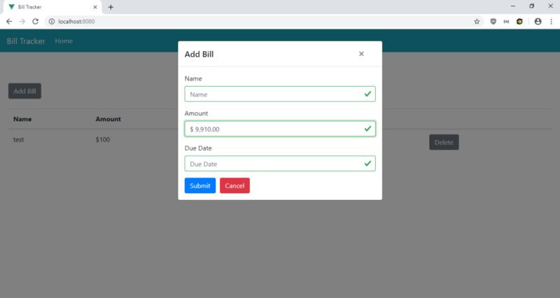
This is where we display the bills in a BootstrapVue table. The columns are the name, the amount, and the due date, along with the Edit button to open the edit modal, and Delete button to delete an entry when it’s clicked. We also added an ‘Add Bill’ button to open the modal to let users add a bill. The notes are obtained from the back end by running the this.getAllBills function in the beforeMount hook which stores the data in our Vuex store.
The openAddModal, openEditModal, closeModal open the open and close modals, and close the modal respectively. When openEditModal is called, we set the this.selectedNote variable so that we can pass it to our NoteForm .
Next in App.vue , we replace the existing code with:
<template>
<div id="app">
<b-navbar toggleable="lg" type="dark" variant="info">
<b-navbar-brand to="/">Bill Tracker</b-navbar-brand>
<b-navbar-toggle target="nav-collapse"></b-navbar-toggle>
<b-collapse id="nav-collapse" is-nav>
<b-navbar-nav>
<b-nav-item to="/" :active="path == '/'">Home</b-nav-item>
</b-navbar-nav>
</b-collapse>
</b-navbar>
<router-view />
</div>
</template>
<script>
export default {
data() {
return {
path: this.$route && this.$route.path
};
},
watch: {
$route(route) {
this.path = route.path;
}
}
};
</script>
<style lang="scss">
.page {
padding: 20px;
}
button,
.btn.btn-primary {
margin-right: 10px !important;
}
.button-toolbar {
margin-bottom: 10px;
}
</style>
to add a Bootstrap navigation bar to the top of our pages, and a router-view to display the routes we define. This style section isn’t scoped so the styles will apply globally. In the .page selector, we add some padding to our pages. We add some padding to the buttons in the remaining style code.
Then in main.js , replace the existing code with:
import Vue from "vue";
import App from "./App.vue";
import router from "./router";
import store from "./store";
import money from "v-money";
import VueFilterDateFormat from "vue-filter-date-format";
import BootstrapVue from "bootstrap-vue";
import { ValidationProvider, extend, ValidationObserver } from "vee-validate";
import { required, min_value } from "vee-validate/dist/rules";
import "bootstrap/dist/css/bootstrap.css";
import "bootstrap-vue/dist/bootstrap-vue.css";
extend("required", required);
extend("min_value", min_value);
extend("date", {
validate: value => {
return /([12]d{3}-(0[1-9]|1[0-2])-(0[1-9]|[12]d|3[01]))/.test(value);
},
message: "Date must be in YYYY-MM-DD format."
});
Vue.use(BootstrapVue);
Vue.component("ValidationProvider", ValidationProvider);
Vue.component("ValidationObserver", ValidationObserver);
Vue.use(money, { precision: 4 });
Vue.use(VueFilterDateFormat);
Vue.config.productionTip = false;
new Vue({
router,
store,
render: h => h(App)
}).$mount("#app");
We added all the libraries we need here, including BootstrapVue JavaScript and CSS and Vee-Validate components along with the required validation rule and a date rule for validating that the due date is YYYY-MM-DD format.
In router.js we replace the existing code with:
import Vue from "vue";
import Router from "vue-router";
import Home from "./views/Home.vue";

Vue.use(Router);

export default new Router({
  mode: "history",
  base: process.env.BASE_URL,
  routes: [
    {
      path: "/",
      name: "home",
      component: Home
    }
  ]
});
to include the home page in our routes so users can see the page.
And in store.js , we replace the existing code with:
import Vue from "vue";
import Vuex from "vuex";

Vue.use(Vuex);

export default new Vuex.Store({
  state: {
    bills: []
  },
  mutations: {
    setBills(state, payload) {
      state.bills = payload;
    }
  },
  actions: {}
});
to add our bills state to the store so we can observe it in the computed block of BillForm and HomePage components. We have the setBills function to update the notes state and we use it in the components by call this.$store.commit(“setBills”, data); like we did in BillForm and HomePage .
Finally, in index.html , we replace the existing code with:
<!DOCTYPE html>
<html lang="en">
  <head>
    <meta charset="utf-8" />
    <meta http-equiv="X-UA-Compatible" content="IE=edge" />
    <meta name="viewport" content="width=device-width,initial-scale=1.0" />
    <link rel="icon" href="<%= BASE_URL %>favicon.ico" />
    <title>Bill Tracker</title>
  </head>
  <body>
    <noscript>
      <strong
        >We're sorry but v-money-tutorial-app doesn't work properly without
        JavaScript enabled. Please enable it to continue.</strong
      >
    </noscript>
    <div id="app"></div>
    <!-- built files will be auto injected -->
  </body>
</html>
to change the title of our app.
After all the hard work, we can start our app by running npm run serve.
To start the back end, we first install the json-server package by running npm i json-server. Then, go to our project folder and run:
json-server --watch db.json
In db.json, change the text to:
{
  "`bills`": []
}
So we have the bills endpoints defined in the requests.js available.
After all the hard work, we get: