Categories
Vue

Add Simple State Management with Vuex

Vue.js is an easy to use web app framework that we can use to develop interactive front end apps.

With Vuex, we can store our Vue app’s state in a central location.

In this article, we’ll look at how to add Vuex to our app and add a simple store.

What is Vuex?

Vuex is for storing states that are needed by multiple components in one central location.

It lets us get and set shared state and propagate any changes made to the shared state automatically to all components.

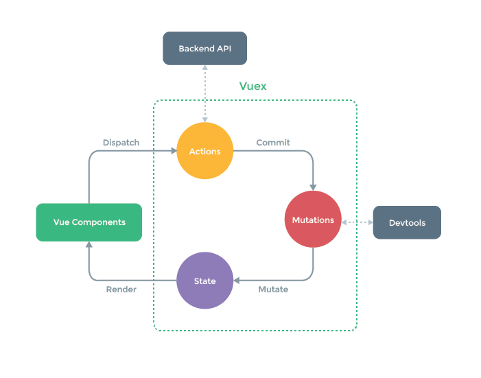
Courtesy of https://vuex.vuejs.org/

In the workflow diagram above, we can see that Vuex mutations are committed by our code when we get something from the back end API.

The mutation will update the state with the back end API data and the state will be updated in our Vue components.

We can also dispatch mutations from Vue components to change the Vuex store state the change will be propagated to all components that have access to the store.

Getting Started

We can include Vuex with a script tag in our HTML code:

<script src="https://unpkg.com/vuex"></script>

Then we can create a simple store by using the Vuex.Store as follows:

const store = new Vuex.Store({
  state: {
    count: 0
  },
  mutations: {
    increase(state) {
      state.count++;
    }
  }
});

The code above is a store which stores the state count .

Then we can commit the increase mutation by running:

store.commit("increase");

Then we can get the state after the mutation is done by running:

console.log(store.state.count);

store.state.count is the count state from the Vuex store. Then we should see 1 logged.

Getting Vuex State into Vue Components

We can get the state into our store by adding a computed property.

Therefore, to add the state into our store, we can write the following:

index.js :

const store = new Vuex.Store({
  state: {
    count: 0
  },
  mutations: {
    increase(state) {
      state.count++;
    }
  }
});

new Vue({
  el: "#app",
  computed: {
    count() {
      return store.state.count;
    }
  }
});

index.html :

<!DOCTYPE html>
<html>
  <head>
    <title>App</title>
    <meta charset="UTF-8" />
    <script src="https://unpkg.com/vue/dist/vue.js"></script>
    <script src="https://unpkg.com/vuex"></script>
  </head>
  <body>
    <div id="app">
      <p>{{count}}</p>
    </div>
    <script src="index.js"></script>
  </body>
</html>

Then we should see 0 displayed since count is 0 initially in the store .

Then whenever store.state.count updates, the computed property will be updated and the view will update with the new value.

A more convenient way to inject the store into all child components is to add the store in the root component as follows:

index.js :

const store = new Vuex.Store({
  state: {
    count: 0
  },
  mutations: {
    increase(state) {
      state.count++;
    }
  }
});

new Vue({
  el: "#app",
  store
});

index.html :

<!DOCTYPE html>
<html>
  <head>
    <title>App</title>
    <meta charset="UTF-8" />
    <script src="https://unpkg.com/vue/dist/vue.js"></script>
    <script src="https://unpkg.com/vuex"></script>
  </head>
  <body>
    <div id="app">
      <p>{{$store.state.count}}</p>
    </div>
    <script src="index.js"></script>
  </body>
</html>

Then it’ll be available to all child components and we don’t have to worry about add computed properties for every value.

It works with child component without much changes:

const store = new Vuex.Store({
  state: {
    count: 0
  },
  mutations: {
    increase(state) {
      state.count++;
    }
  }
});

Vue.component("counter", {
  template: `<div>{{ count }}</div>`,
  computed: {
    count() {
      return this.$store.state.count;
    }
  }
});

new Vue({
  el: "#app",
  store
});

this.$store is available to the counter component just by including it in the root Vue component.

Photo by Clark Street Mercantile on Unsplash

The mapState Helper

To avoid adding a new computed property for every state that’s in the store, we can use the mapState helper to add it. For example, we can write the following code to do that:

index.js :

const store = new Vuex.Store({
  state: {
    count: 0
  },
  mutations: {
    increase(state) {
      state.count++;
    }
  }
});

Vue.component("counter", {
  data() {
    return {
      localCount: 1
    };
  },
  template: `
    <div>
      <div>{{ count }}</div>
      <div>{{ countAlias }}</div>
      <div>{{ countPlusLocal }}</div>
    </div>
  `,
  computed: Vuex.mapState({
    count: state => state.count,
    countAlias: "count",
    countPlusLocal(state) {
      return state.count + this.localCount;
    }
  })
});

new Vue({
  el: "#app",
  store
});

index.html :

<!DOCTYPE html>
<html>
  <head>
    <title>App</title>
    <meta charset="UTF-8" />
    <script src="https://unpkg.com/vue/dist/vue.js"></script>
    <script src="https://unpkg.com/vuex"></script>
  </head>
  <body>
    <div id="app">
      <counter></counter>
    </div>
    <script src="index.js"></script>
  </body>
</html>

Then we see:

0

0

1

Because we called mapState as follows:

computed: Vuex.mapState({
  count: state => state.count,
  countAlias: "count",
  countPlusLocal(state) {
    return state.count + this.localCount;
  }
})

We have:

count: state => state.count,

which gets the count state from the store and returns it. The count is 0 so we get 0.

Then we have:

countAlias: "count"

which is a shorthand for:

count: state => state.count

And finally, we have:

countPlusLocal(state) {
  return state.count + this.localCount;
}

which adds state.count from the store to this.localCount , which we set to 1.

Object Spread Operator

We can combine local computed properties with mapState by applying the spread operator to mapState as follows:

index.js :

const store = new Vuex.Store({
  state: {
    count: 0
  },
  mutations: {
    increase(state) {
      state.count++;
    }
  }
});

Vue.component("counter", {
  data() {
    return {
      localCount: 1
    };
  },
  template: `
    <div>
      <div>{{ count }}</div>
      <div>{{ foo }}</div>
    </div>
  `,
  computed: {
    foo() {
      return 2;
    },
    ...Vuex.mapState({
      count: "count"
    })
  }
});

new Vue({
  el: "#app",
  store
});

Then we get:

0

2

displayed since foo always returns 2.

Components Can Still Have Local State

Components can still have their own local state, so we don’t have to put everything in the Vuex store.

Conclusion

We can add a Vuex store to our app to store the states of our app that are shared by multiple components.

To make getting state easy, we can include the store in the root Vue component.

Then we call the mapState helper to get the states we want in any component.

We can also combine it with the local states with the spread operator in the computed object.

Categories
Vue

Adding Modules to a Vuex Store

Vue.js is an easy to use web app framework that we can use to develop interactive front end apps.

With Vuex, we can store our Vue app’s state in a central location.

In this article, we’ll look at how to add modules to separate a Vuex store into smaller parts.

Dividing a Store into Modules

Vuex uses a single state tree. This means the states are located in one big object. This will be bloated is our app grows big.

To make a Vuex store easier to scale, it can be separated into modules. Each module can have its own state, mutations, getters, and actions.

The state parameter in mutations and getters are the module’s local state.

By default, all actions, mutations, and getters inside modules are registered under a global namespace. This allows multiple modules to react to the same mutation or action type.

We can divide our store into module as in the following example:

index.js :

const moduleA = {
  state: {
    count: 0
  },
  mutations: {
    increase(state, payload) {
      state.count += payload.amount;
    }
  },
  actions: {
    increase({ commit }, payload) {
      commit("increase", payload);
    }
  }
};

const moduleB = {
  state: {
    count: 1
  },
  mutations: {
    increase(state, payload) {
      state.count += payload.amount;
    }
  },
  actions: {
    increase({ commit }, payload) {
      commit("increase", payload);
    }
  }
};

const store = new Vuex.Store({
  modules: {
    a: moduleA,
    b: moduleB
  }
});

console.log(store.state.a.count);
console.log(store.state.b.count);

Then in the console.log output, we should see 0 and 1 since moduleA ‘s initial count state is 0 and moduleB ‘s initial count state is 1.

To make each module self-contained, we have to namespace it by setting the namespaced option to true .

We can namespace a module and then call dispatch on actions after namespacing the modules as follows:

index.js :

const moduleA = {
  namespaced: true,
  state: {
    count: 0
  },
  mutations: {
    increase(state, payload) {
      state.count += payload.amount;
    }
  },
  actions: {
    increase({ commit }, payload) {
      commit("increase", payload);
    }
  }
};

const moduleB = {
  namespaced: true,
  state: {
    count: 1
  },
  mutations: {
    increase(state, payload) {
      state.count += payload.amount;
    }
  },
  actions: {
    increase({ commit }, payload) {
      commit("increase", payload);
    }
  }
};

const store = new Vuex.Store({
  modules: {
    a: moduleA,
    b: moduleB
  }
});

new Vue({
  el: "#app",
  store,
  computed: {
    ...Vuex.mapState({
      a: state => state.a,
      b: state => state.b
    })
  },
  methods: {
    increaseA(payload) {
      this.$store.dispatch("a/increase", payload);
    },
    increaseB(payload) {
      this.$store.dispatch("b/increase", payload);
    }
  }
});

index.html :

<!DOCTYPE html>
<html>
  <head>
    <title>App</title>
    <meta charset="UTF-8" />
    <script src="https://unpkg.com/vue/dist/vue.js"></script>
    <script src="https://unpkg.com/vuex"></script>
  </head>
  <body>
    <div id="app">
      <button @click="increaseA({amount: 10})">Increase</button>
      <button @click="increaseB({amount: 10})">Increase</button>
      <p>A Count: {{a.count}}</p>
      <p>B Count: {{b.count}}</p>
    </div>
    <script src="index.js"></script>
  </body>
</html>

In the code above, we have namespaced: true set in each module, and then we added 2 methods to our Vue instance to dispatch the namespaced actions:

increaseA(payload) {
  this.$store.dispatch("a/increase", payload);
}

and:

increaseB(payload) {
  this.$store.dispatch("b/increase", payload);
}

Since we have namespaced set to true , we have to dispatch the actions by passing in “a/increase” and “b/increase” to dispatch .

Then once we clicked the buttons, our methods are called to dispatch the actions and the numbers will increase.

Register Global Action in Namespaced Modules

We can also register global actions in namespaced modules, by setting the root option to true and place the action definition in the function handler.

To do register a global action, we can write something like the following code:

index.js :

const moduleA = {
  namespaced: true,
  state: {
    count: 0
  },
  mutations: {
    increase(state, payload) {
      state.count += payload.amount;
    }
  },
  actions: {
    increase({ commit }, payload) {
      commit("increase", payload);
    }
  }
};

const moduleB = {
  namespaced: true,
  state: {
    count: 1
  },
  mutations: {
    increase(state, payload) {
      state.count += payload.amount;
    }
  },
  actions: {
    increase({ commit }, payload) {
      commit("increase", payload);
    }
  }
};

const rootModule = {
  actions: {
    increaseAll: {
      root: true,
      handler(namespacedContext, payload) {
        namespacedContext.commit("a/increase", payload);
        namespacedContext.commit("b/increase", payload);
      }
    }
  }
};

const store = new Vuex.Store({
  modules: {
    a: moduleA,
    b: moduleB,
    root: rootModule
  }
});

new Vue({
  el: "#app",
  store,
  computed: {
    ...Vuex.mapState({
      a: state => state.a,
      b: state => state.b
    })
  },
  methods: {
    ...Vuex.mapActions(["increaseAll"])
  }
});

index.html :

<!DOCTYPE html>
<html>
  <head>
    <title>App</title>
    <meta charset="UTF-8" />
    <script src="https://unpkg.com/vue/dist/vue.js"></script>
    <script src="https://unpkg.com/vuex"></script>
  </head>
  <body>
    <div id="app">
      <button @click="increaseAll({amount: 10})">Increase All</button>
      <p>A Count: {{a.count}}</p>
      <p>B Count: {{b.count}}</p>
    </div>
    <script src="index.js"></script>
  </body>
</html>

In the code above, we added the rootModule which has the global action as follows:

const rootModule = {
  actions: {
    increaseAll: {
      root: true,
      handler(namespacedContext, payload) {
        namespacedContext.commit("a/increase", payload);
        namespacedContext.commit("b/increase", payload);
      }
    }
  }
};

A global action has the root option set to true and a handler method which is used to dispatch actions from any module.

Then in the Vue instance, we have:

methods: {
  ...Vuex.mapActions(["increaseAll"])
}

to map the increaseAll action to a method in the Vue instance.

Then in the template, we have:

<button @click="increaseAll({amount: 10})">Increase All</button>

to call the increaseAll method returned from the mapActions method when the button is clicked.

Then we should both numbers increasing since we mapped both module’s state to the Vue instance’s data.

Dynamic Module Registration

We can also register a module dynamically by using the store.registerModule method as follows:

index.js :

const moduleA = {
  state: {
    count: 0
  },
  mutations: {
    increase(state, payload) {
      state.count += payload.amount;
    }
  },
  actions: {
    increase({ commit }, payload) {
      commit("increase", payload);
    }
  }
};

const store = new Vuex.Store({});

store.registerModule("a", moduleA);

new Vue({
  el: "#app",
  store,
  computed: {
    ...Vuex.mapState({
      a: state => state.a
    })
  },
  methods: {
    ...Vuex.mapActions(["increase"])
  }
});

index.html :

<!DOCTYPE html>
<html>
  <head>
    <title>App</title>
    <meta charset="UTF-8" />
    <script src="https://unpkg.com/vue/dist/vue.js"></script>
    <script src="https://unpkg.com/vuex"></script>
  </head>
  <body>
    <div id="app">
      <button @click="increase({amount: 10})">Increase</button>
      <p>A Count: {{a.count}}</p>
    </div>
    <script src="index.js"></script>
  </body>
</html>

The store.registerModule takes a string for the module name, and then an object for the module itself.

Then we can call the helpers to map getters to computed properties and actions/mutations to methods. In the code above, we have the increase action mapped to a method.

Then we can call it in our template as usual.

Conclusion

If our Vuex store is big, we can divide it into modules.

We can register modules when we create the store or dynamically with registerModule .

Then we can map actions/mutations by their name as usual, and we can map the state by accessing state.a.count , where a is the module name, and count is the state name. Replace it with our own module and state names if the code is different.

We can also namespace the modules. Then we dispatch the actions starting with the module name and a slash instead of just the name.

Categories
Vuetify

Vuetify — Weather Card and Carousel

Vuetify is a popular UI framework for Vue apps.

In this article, we’ll look at how to work with the Vuetify framework.

Weather Card

We can add a weather card with Vuetify.

For example, we can write:

<template>
  <v-container>
    <v-row>
      <v-col col="12">
        <v-card class="mx-auto" max-width="400">
          <v-list-item two-line>
            <v-list-item-content>
              <v-list-item-title class="headline">London</v-list-item-title>
              <v-list-item-subtitle>Mon, 12:30 PM, Mostly sunny</v-list-item-subtitle>
            </v-list-item-content>
          </v-list-item>

          <v-card-text>
            <v-row align="center">
              <v-col class="display-3" cols="6">23&deg;C</v-col>
              <v-col cols="6">
                <v-img
                   src="https://cdn.vuetifyjs.com/images/cards/sun.png"
                  alt="Sunny image"
                  width="92"
                ></v-img>
              </v-col>
            </v-row>
          </v-card-text>

          <v-list-item>
            <v-list-item-icon>
              <v-icon>mdi-send</v-icon>
            </v-list-item-icon>
            <v-list-item-subtitle>23 km/h</v-list-item-subtitle>
          </v-list-item>

          <v-list-item>
            <v-list-item-icon>
              <v-icon>mdi-cloud-download</v-icon>
            </v-list-item-icon>
            <v-list-item-subtitle>48%</v-list-item-subtitle>
          </v-list-item>

          <v-slider v-model="time" :max="6" :tick-labels="labels" class="mx-4" ticks></v-slider>

          <v-list class="transparent">
            <v-list-item v-for="item in forecast" :key="item.day">
              <v-list-item-title>{{ item.day }}</v-list-item-title>

              <v-list-item-icon>
                <v-icon>{{ item.icon }}</v-icon>
              </v-list-item-icon>

              <v-list-item-subtitle class="text-right">{{ item.temp }}</v-list-item-subtitle>
            </v-list-item>
          </v-list>

          <v-divider></v-divider>

          <v-card-actions>
            <v-btn text>Full Report</v-btn>
          </v-card-actions>
        </v-card>
      </v-col>
    </v-row>
  </v-container>
</template>

<script>
export default {
  name: "HelloWorld",
  data: () => ({
    labels: ["SU", "MO", "TU", "WED", "TH", "FR", "SA"],
    time: 0,
    forecast: [
      {
        day: "Tuesday",
        icon: "mdi-white-balance-sunny",
        temp: "24xB0/12xB0",
      },
      {
        day: "Wednesday",
        icon: "mdi-white-balance-sunny",
        temp: "22xB0/14xB0",
      },
      { day: "Thursday", icon: "mdi-cloud", temp: "25xB0/15xB0" },
    ],
  }),
};
</script>

We add a v-card with the v-list-item with the text.

The v-card-text has the degrees and image for the weather.

Below that, we have the text for the cloud and wind speed.

And we have the slider for the days.

And a list for the forecast.

The forecast are rendered from the forecast object.

At the bottom, we have the v-btn for the actions.

Carousels

The v-carousel component is used to display a large number of visual content on a rotating timer.

We can create a simple one by writing:

<template>
  <v-container>
    <v-row>
      <v-col col="12">
        <v-carousel cycle height="400" hide-delimiter-background show-arrows-on-hover>
          <v-carousel-item v-for="(slide, i) in slides" :key="i">
            <v-sheet :color="colors[i]" height="100%">
              <v-row class="fill-height" align="center" justify="center">
                <div class="display-3">Slide {{ slide }}</div>
              </v-row>
            </v-sheet>
          </v-carousel-item>
        </v-carousel>
      </v-col>
    </v-row>
  </v-container>
</template>

<script>
export default {
  name: "HelloWorld",
  data: () => ({
    colors: [
      "indigo",
      "warning",
      "pink darken-2",
      "red lighten-1",
      "deep-purple accent-4",
    ],
    slides: [1, 2, 3, 4, 5],
  }),
};
</script>

We use the v-carousel component with v-carousel-item s inside.

The background color for the slides are set with the color prop.

Conclusion

We can add a carousel and weather card with Vuetify.

Categories
Vuetify

Vuetify — Outlined and Floating Buttons

Vuetify is a popular UI framework for Vue apps.

In this article, we’ll look at how to work with the Vuetify framework.

Outlined Buttons

We can create outlined buttons with the outlined prop.

For example, we can write:

<template>
  <v-container>
    <v-row class="text-center">
      <v-col col="12">
        <v-btn class="ma-2" outlined color="indigo">Outlined Button</v-btn>
      </v-col>
    </v-row>
  </v-container>
</template>

<script>
export default {
  name: "HelloWorld",
  data: () => ({}),
};
</script>

We can also create an outlined button with an icon inside:

<template>
  <v-container>
    <v-row class="text-center">
      <v-col col="12">
        <v-btn class="ma-2" outlined fab color="teal">
          <v-icon>mdi-format-list-bulleted-square</v-icon>
        </v-btn>
      </v-col>
    </v-row>
  </v-container>
</template>

<script>
export default {
  name: "HelloWorld",
  data: () => ({}),
};
</script>

Block Button

A block button extends the full width of the screen.

To add one, we can add the block prop:

<template>
  <v-container>
    <v-row class="text-center">
      <v-col col="12">
        <v-btn block color="secondary" dark>Block Button</v-btn>
      </v-col>
    </v-row>
  </v-container>
</template>

<script>
export default {
  name: "HelloWorld",
  data: () => ({}),
};
</script>

Button Loaders

We can display a loading indicator on the button to notify the user that processing is taking place.

The default behavior is to use a v-progress-circular component.

This can be customized.

For example, we can write:

<template>
  <v-container>
    <v-row class="text-center">
      <v-col col="12">
        <v-btn
          class="ma-2"
          :loading="loading"
          :disabled="loading"
          color="secondary"
          @click="loading = true"
        >Accept Terms</v-btn>
      </v-col>
    </v-row>
  </v-container>
</template>

<script>
export default {
  name: "HelloWorld",
  data: () => ({
    loading: false,
  }),
};
</script>

Then we can see the loading indicator when we click the button.

loading is set to true so that the loading indicator is shown.

The loading prop is set to the loading state.

Buttons: Floating Action Button

We can add a gloating action button with the fab prop.

For example, we can write:

<template>
  <v-container>
    <v-row class="text-center">
      <v-col col="12">
        <v-card>
          <v-toolbar color="light-blue" light extended>
            <v-app-bar-nav-icon></v-app-bar-nav-icon>
            <v-toolbar-title class="white--text">App</v-toolbar-title>
            <v-spacer></v-spacer>
            <v-btn icon>
              <v-icon>mdi-magnify</v-icon>
            </v-btn>
            <v-btn icon>
              <v-icon>mdi-view-module</v-icon>
            </v-btn>
            <template v-slot:extension>
              <v-btn fab color="cyan accent-2" bottom left absolute @click="dialog = !dialog">
                <v-icon>mdi-plus</v-icon>
              </v-btn>
            </template>
          </v-toolbar>
        </v-card>
      </v-col>
    </v-row>
  </v-container>
</template>

<script>
export default {
  name: "HelloWorld",
  data: () => ({
    dialog: false,
  }),
};
</script>

We add a v-btn into the extension slot so that it shows in the bottom left of the toolbar.

Also, we set the color prop and add the bottom and left props to make it show in the bottom left.

absolute makes it display with an absolute position.

Display Animation

We can display animation when showing and hiding floating action buttons.

For example, we can write:

<template>
  <v-container>
    <v-row class="text-center">
      <v-col col="12">
        <v-card>
          <v-toolbar extended>
            <v-app-bar-nav-icon></v-app-bar-nav-icon>
            <template v-slot:extension>
              <v-fab-transition>
                <v-btn v-show="!hidden" color="pink" fab dark small absolute bottom left>
                  <v-icon>mdi-plus</v-icon>
                </v-btn>
              </v-fab-transition>
            </template>
          </v-toolbar>
          <v-card-text style="height: 300px;" class="grey lighten-5 text-center">
            <v-btn color="primary" @click="hidden = !hidden">{{ hidden ? 'Show' : 'Hide' }}</v-btn>
          </v-card-text>
          <v-card-text style="height: 100px; position: relative">
            <v-fab-transition>
              <v-btn v-show="!hidden" color="pink" dark absolute top right fab>
                <v-icon>mdi-plus</v-icon>
              </v-btn>
            </v-fab-transition>
          </v-card-text>
        </v-card>
      </v-col>
    </v-row>
  </v-container>
</template>

<script>
export default {
  name: "HelloWorld",
  data: () => ({
    hidden: false,
  }),
};
</script>

We added the v-fab-transition prop into the extension slot to make the floating action button toggle on and off with animation.

The toggling is done with the hidden prop.

We use the small prop to make it small.

bottom and left position the button icons.

absolute makes the position absolute.

fab makes the button a floating action button.

Conclusion

We can display various kinds of buttons with Vuetify.

Categories
Vuetify

Vuetify — Floating Action Buttons

Vuetify is a popular UI framework for Vue apps.

In this article, we’ll look at how to work with the Vuetify framework.

Floating Action Button with Speed-Dial

We can add a floating action button with a speed dial with the v-speed-dial component.

For instance, we can write:

<template>
  <v-container>
    <v-row class="text-center">
      <v-col col="12">
        <v-card id="create">
          <v-container fluid style='height: 300px'></v-container>
          <v-speed-dial
            v-model="fab"
            bottom
            direction="top"
            :open-on-hover="false"
            transition="slide-y-reverse-transition"
          >
            <template v-slot:activator>
              <v-btn v-model="fab" color="blue darken-2" dark fab>
                <v-icon v-if="fab">mdi-close</v-icon>
                <v-icon v-else>mdi-account-circle</v-icon>
              </v-btn>
            </template>
            <v-btn fab dark small color="green">
              <v-icon>mdi-pencil</v-icon>
            </v-btn>
            <v-btn fab dark small color="indigo">
              <v-icon>mdi-plus</v-icon>
            </v-btn>
            <v-btn fab dark small color="red">
              <v-icon>mdi-delete</v-icon>
            </v-btn>
          </v-speed-dial>
        </v-card>
      </v-col>
    </v-row>
  </v-container>
</template>

<script>
export default {
  name: "HelloWorld",
  data: () => ({
    fab: false,
  }),
};
</script>

We have the v-container component to space the button.

The activator flow has a floating action button.

The v-model controls the speed dial display.

The value of fab is changed when we click on the button.

The v-speed-dial display is also controlled by the fab state.

It’ll be shown when fab is true .

The bottom prop makes it display at the bottom.

direction changes the direction that the speed dial is displayed on.

open-on-hover lets us control whether we open the speed dial on hover.

transition make us change the transition effect.

Lateral Screens

When we change tabs, we can display a different floating action button.

For example, we can write:

<template>
  <v-container>
    <v-row class="text-center">
      <v-col col="12">
        <v-card id="lateral">
          <v-toolbar dark tabs flat color="indigo">
            <v-app-bar-nav-icon></v-app-bar-nav-icon>
            <v-toolbar-title>Page title</v-toolbar-title>
            <v-spacer></v-spacer>
            <v-btn icon>
              <v-icon>mdi-magnify</v-icon>
            </v-btn>
            <v-btn icon>
              <v-icon>mdi-dots-vertical</v-icon>
            </v-btn>
            <template v-slot:extension>
              <v-tabs v-model="tabs" align-with-title>
                <v-tab href="#one">Item One</v-tab>
                <v-tab href="#two">Item Two</v-tab>
                <v-tab href="#three">Item Three</v-tab>
                <v-tabs-slider color="pink"></v-tabs-slider>
              </v-tabs>
            </template>
          </v-toolbar>
          <v-card-text>
            <v-tabs-items v-model="tabs">
              <v-tab-item
                v-for="content in ['one', 'two', 'three']"
                :key="content"
                :value="content"
              >
                <v-card height="200px" flat></v-card>
              </v-tab-item>
            </v-tabs-items>
          </v-card-text>
          <v-fab-transition>
            <v-btn
              :key="activeFab.icon"
              :color="activeFab.color"
              fab
              large
              dark
              bottom
              left
              class="v-btn--example"
            >
              <v-icon>{{ activeFab.icon }}</v-icon>
            </v-btn>
          </v-fab-transition>
        </v-card>
      </v-col>
    </v-row>
  </v-container>
</template>

<script>
export default {
  name: "HelloWorld",
  data: () => ({
    fab: false,
    hidden: false,
    tabs: null,
  }),

  computed: {
    activeFab() {
      switch (this.tabs) {
        case "one":
          return { color: "success", icon: "mdi-pencil" };
        case "two":
          return { color: "red", icon: "mdi-plus" };
        case "three":
          return { color: "green", icon: "mdi-delete" };
        default:
          return {};
      }
    },
  },
};
</script>

We have the color prop to change the color.

The v-icon has our icon.

We use a computed property to compute the value of the floating action button icon and color to display.

The large prop makes the button big.

dark makes the button darker.

bottom and left makes the button display on the bottom left.

Conclusion

Floating action buttons can be displayed statically and dynamically.

We can also use them to trigger a speed dial.